First Design Sheets with thumbnail sketches of ideas I had for the vinyl cover.


Idea 1
I began with the lines looking like a vinyl record, I then wanted to vary the lines with a heartbeat that goes up and down because like the song things could go up or down.

I also tried to add a heart into the lines however I felt that this has been done before.


This is the vinyl shape started with I looked at images on google to replicate the lines of a vinyl record. Which meant some of the circles where closer together than others.

I experimented with different coloured hearts


I chose a darker red as I felt it matched the artists vintage/ sophisticated style.


I experimented with different sizes of the image.


However liked the size the image had firstly been.
I also looked the hearts just on their own after i had seen something in my research. however this did just look random.

I also tried a different colour variation however I didn't think that this was as successful.


I also tried different weights of the lines but I think that this was very distracting and the vinyl record aesthetic became lost.

I did also try the whole design in just black but this made it slightly boring.

And so this was the final Idea.

Idea 2
My next Idea was to create the idea of a broken heart and a full heart as a contrast.
I initially used the heart I had created and on pathfinder I divided it into segments. I then used an opacity effect to contrast the two.

I liked this design better when the hearts where central.


Grey and White just looked dark and dim.

I liked the deep red background as it looked warmer and more interesting. I did then experiment with different opacities....


I found that this combination was the best and so I stuck with it as Idea 2.

Idea 3
I then experimented with origami hearts. I did this with different coloured paper. The idea behind the paper is a love note. And I felt that it would create an interesting geometric shape.


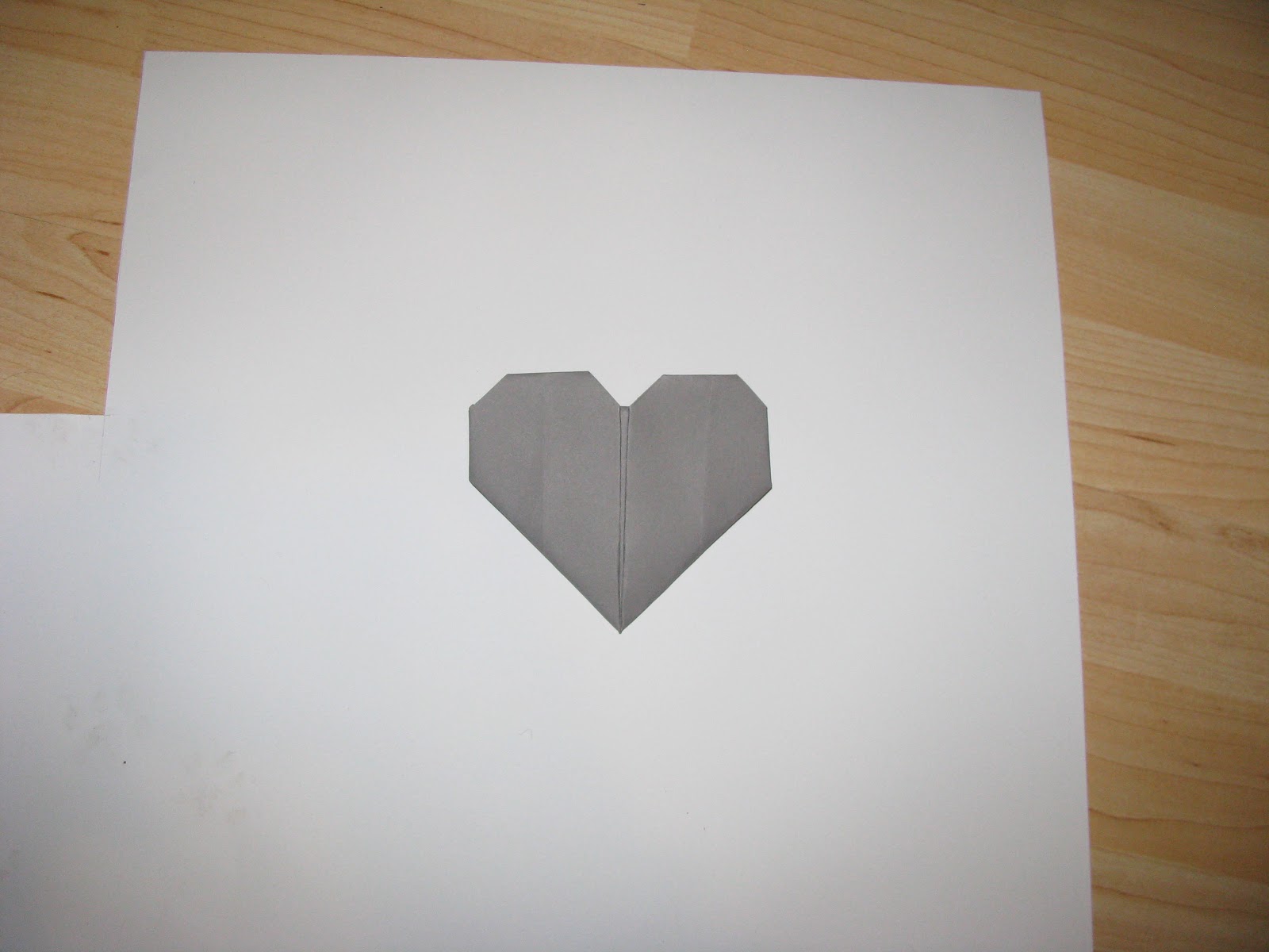


I also mixed the red and purple red together to make a contrast.
I tried them slightly apart but parallel. Which I think separates the two.


I also tried them together I found this less effective as there is no space or seperation between them.


I also tried to put one of the sides at angle as if it was coming away or breaking. However I think that this looks quite random.

And I then went back to my original variation but separated the gap, but there was too much space here and they look too separated.

I also then tried the idea of opening the heart at one side, to represent the idea of an open heart. However this looks like an arrow.

I also tried different backgrounds however there are too many different elements.


I then tried putting the hearts opposite to each other, like one of my original sketches, however again I feel like there is too much going on.

And the detail of the white heart seems to of disappeared.


I did try it on the darker purple/red background but still the white heart is lost. But the colours do look better.


I then tried the contrasting heart all together, almost like a bouquet, black vs white, and light red vs dark red. But I think that they just cancel each other out and the message is lost.


I then also tried it where I ripped one side of the heart, again like it was a torn/broken heart. I really liked this concept.


I did try this idea with a separate colour for the other side of the heart but it was distracting and they didn't look like they where part of the same image.


And so I began to develop this heart on the computer. I experimented with a spotlight like effect. However in this image below the edges where too dark and distracting.


I also experimented with the colour of the heart.


Here I had made the heart a vivid pink but this doesn't match the artist or her music.

And so I made the heart this more purple red colour that was more desaturated.


And so this became the final outcome, Idea 3.


I had also thought back to the actual music of the song which has a very percussion orientated beat, and the thought of a beat made me look up what a musical beat looks like and I found bars that contained different lines that where different weights. Almost like different sounds. And so I replicated this in the idea below. At the end I used a single long line to create the idea of silence, or no sound, no love.

However I felt that the bar second in was too tall and so I erased some of the top of it.


I then tried the bars in red , stereotypical colour for love.
However the detail looks a little bit lost.

I also tried this in reverse like I had done in idea 1. However I didn't like this idea as much either.

I didn't like how the line continued of the page and so I moved the bars into the centre.

I also tried to make some of the lines into a series of hearts. However from a distance they look like triangles.

I also then felt the image should be central, and so I had to erase one of the bars and move them into the centre. And this made the single black line more effective.

I also used the idea of the origami hearts to create geometric outlines .
And I experimented with the idea of an open and closed heart, with a outline of a net and then the heart it makes. I did this by tracing the photographs of the heart and net I had created.

I did also experiment with a lower opacity net with a thicker weight so that it looked like more of a background piece.


I also experimented with different colours for the heart and its lines, but I think that this loses the idea of a geometric shape.


In this variation I have filled the heart in red and the black outlines.

I did also try the heart on its own but it was too simplistic.

I also then again tried a red heart but this looks flat and unappealing.

Like in my photographs tried a combination of half and half to act as a contrast but this did not look right either.

I also tried the heart without the lines I think it looks okay but its slightly boring.

Also when I had been experimenting with idea 4 and reflecting back on my development I'd played with the idea of a heart and a teardrop. And this is how it had looked in my experimentation.

And so I firstly traced the shapes and filled in the colours red and blue so that it would recognisably be a heart and teardrop.

I also felt that the shapes where too rigid and it may not be completly recognisable what each shape is meant to be.

However I did feel that the colours looked slightly childish and so I removed them.

I did try experimenting with half colours to act almost as a double contrast.


But I felt that they worked best very minimalistically. Idea 6

And so I decided upon these 5 ideas to take to my critique, so I could be more informed as to which idea people preferred and how I could develop these ideas further.
1.
2.
3.
4.
