How to
From our previous research the question we where set as a group was
Get somebody to tell the truth more.
And so we had to answer
How to get someone to tell the truth more.
And so from what we had all researched we mind mapped who we could aim this at. After consideration we realised that a major factor that make people feel unconfident by lying is the media.
Especially gossip magazines and adverts.
And so we decided to aim our question at them.
Intially we decided some key thing that the media lie about which make people feel unconfident these are
Weight Issues portrayed
Bad role models
Fake messages within advertising
We decided we needed to show this by pointing out the facts, getting statistics from real people which a member of the group had already done in his own research previously, and using imagery, showing the media how they directly effect people with their lies.
We began by deciding how we where going to do this, and then we designated roles.
Originally we where going to design a double page spread like a magazine, and so it would have a front cover, double page spread and a back cover.
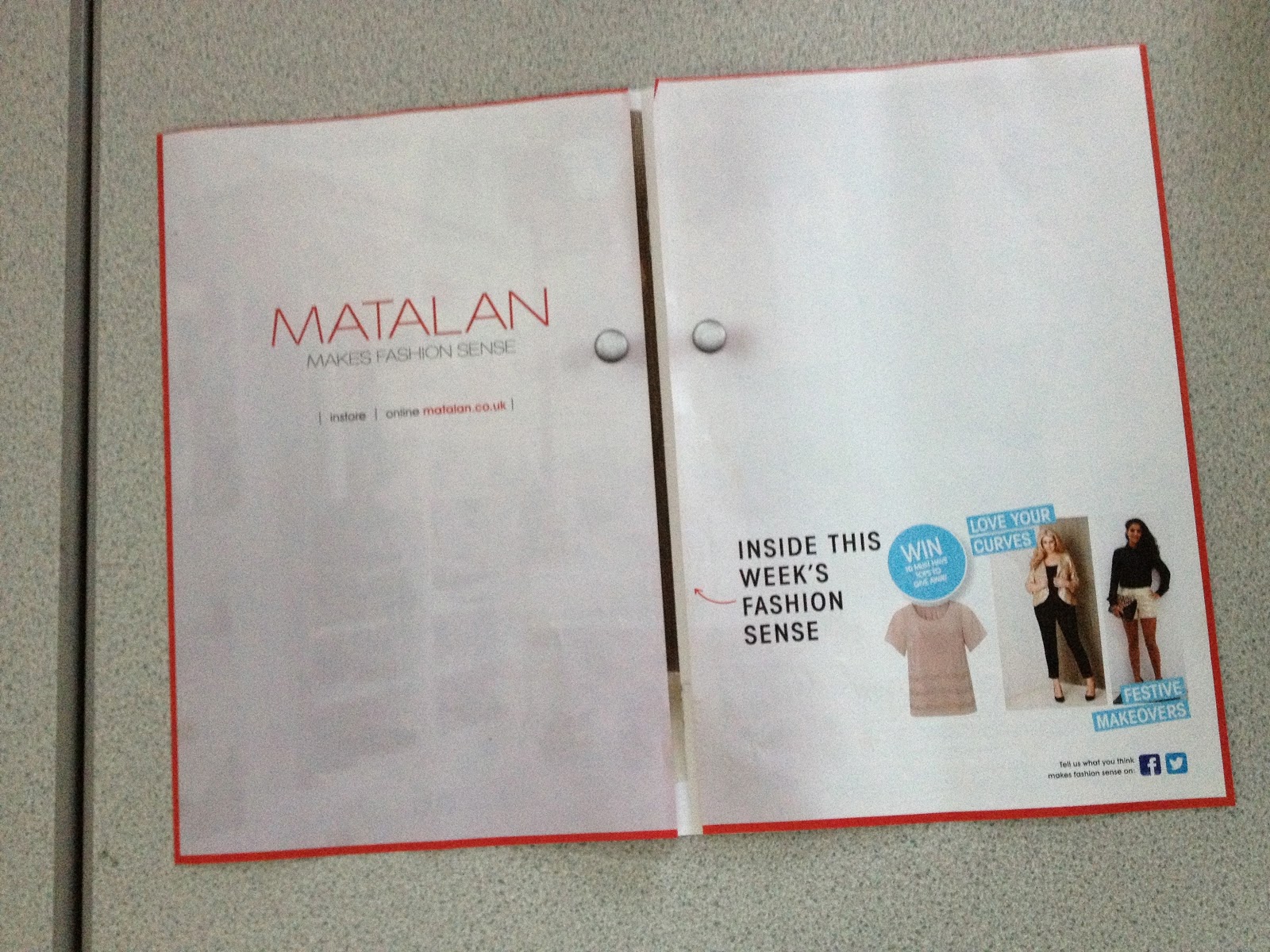
However after researching, in one of the magazines there was an advertisement for matalan where the pages folded out into an A2 length piece (four A4's) ...
And so we decided to use this format. This could be sent out on its own or like this matalan advert it could be in the middle of a magazine.
I bought a magazine and went through the pages to find stories about weight
 |
| A letter from another celebrity expressing how Ella Henderson who is only 16 is becoming a target of the media about her weight. |
 |
| Ella Henderson |
 |
| The caption from her mouth says 'booty-ful' I think that this may affect girls who feel sensitive about their weight if they have had comments like this in the past. Aswell as this it is another jibe a bully could use. |
 |
| The media also attack celebrities in the same way, some of the comments in the captions are very negative and may encourage girls to wear more make-up at a younger age. Even further consequences of things like this is women going for cosmetic surgery to look younger , 'better' without makeup. |
 |
| A story perceiving that the girl group girls aloud are in competition about their weight, basically who can be the skinniest ? However to me this seems like it is completely false and it is just a story to fill the magazine. However if somebody was to believe this story they may feel a pressure to be like girls aloud or more. The girls in girls aloud are already slim and to me this article is very negative and could have negative effects such as eating disorders and low self esteem. |
 |
| Also there was an advert for Spanx like clothing however as you can see the model is already very slim and why would she need to use them in the first place ? Again piling on the pressure to be slim and small. |
 |
| I also found this image which isnt about weight its about plastic surgery going to far. However the celebrity Chloe Sims has recently told the media she recieves constant bullying on social networking sites and from the media themselves. I think that this picture shows how tragic it can be to feel the need to undergo all that plastic surgery to fit into the medias perception of beautiful. |
I was set the role of portraying the consequences of the lies the media use. In doing this I would also expose the lies they tell. And so I began by searching online.
I began by google searching Do magazines cause eating disorders
I took me to this site
http://www.something-fishy.org/cultural/themedia.php
I obtained these two paragraphs which to me summed up why peoples perception of thier weight is becoming more and more negative and why people are feeling the need to go on extreme diets and develop eating disorders. To be it describes the pressure the media is placing on people especially young girls and they are destroying thier confidence and self esteem. Aswell as this these paragraphs reveal some of the truths about the models in the magazines.
With an increased population of children who spend a lot of time in front of television, there are more of them coming up with a superficial sense of who they are. Images on T.V. spend countless hours telling us to lose weight, be thin and beautiful, buy more stuff because people will like us and we'll be better people for it. Programming on the tube rarely depicts men and women with "average" body-types or crappy clothes, ingraining in the back of all our minds that this is the type of life we want. Overweight characters are typically portrayed as lazy, the one with no friends, or "the bad guy", while thin women and pumped-up men are the successful, popular, sexy and powerful ones. How can we tell our children that it's what's inside that counts, when the media continuously contradicts this message?
Super models in all the popular magazines have continued to get thinner and thinner. Modeling agencies have been reported to actively pursue Anorexic models. The average woman model weighs up to 25% less than the typical woman and maintains a weight at about 15 to 20 percent below what is considered healthy for her age and height. Some models go through plastic surgery, some are "taped-up" to mold their bodies into more photogenic representations of themselves, and photos are airbrushed before going to print. By far, these body types and images are not the norm andunobtainable to the average individual.
This then led me to this website
About-Face organization:
"400-600 advertisements bombard us everyday in magazines, on billboards, on tv, and in newspapers. One in eleven has a direct message about beauty, not even counting the indirect messages."
http://www.apa.org/pi/women/programs/girls/report.aspx
Then the website took me to this study
In study after study, findings have indicated that women more often than men are portrayed in a sexual manner (e.g., dressed in revealing clothing, with bodily postures or facial expressions that imply sexual readiness) and are objectified (e.g., used as a decorative object, or as body parts rather than a whole person). In addition, a narrow (and unrealistic) standard of physical beauty is heavily emphasized. These are the models of femininity presented for young girls to study and emulate.
For example, O’Donohue, Gold and McKay (1997) coded advertisements over a 40-year period in five magazines targeted to men, women or a general adult readership. Although relatively few (1.5 percent) of the ads portrayed children in a sexualized manner, of those that did, 85 percent sexualized girls rather than boys. Furthermore, the percentage of sexualizing ads increased over time.
Research links sexualization with three of the most common mental health problems of girls and women: eating disorders, low self-esteem and depression or depressed mood (Abramson & Valene, 1991; Durkin & Paxton, 2002; Harrison, 2000; Hofschire & Greenberg, 2001; Mills, Polivy, Herman & Tiggemann, 2002; Stice, Schupak-Neuberg, Shaw & Stein, 1994; Thomsen, Weber & Brown, 2002; Ward, 2004).
Self-objectification has been linked directly with diminished sexual health among adolescent girls (e.g., as measured by decreased condom use and diminished sexual assertiveness; Impett, Schooler & Tolman, 2006). Frequent exposure to narrow ideals of attractiveness is associated with unrealistic and/or negative expectations concerning sexuality. Negative effects (e.g., shame) that emerge during adolescence may lead to sexual problems in adulthood (Brotto, Heiman & Tolman, in press).
Just recently, new mom Kourtney Kardashian was caught out as she juggled baby gear. As reported by the UK’s Daily Mail (the definitive leader in Spanx-watching), Kourtney was wearing a loose top that rode up as she lifted. There were Spanx peeking out underneath.
The sexualization of girls can also have a negative impact on other groups (i.e., boys, men, and adult women) and on society more broadly. Exposure to narrow ideals of female sexual attractiveness may make it difficult for some men to find an “acceptable” partner or to fully enjoy intimacy with a female partner (e.g., Schooler & Ward, 2006).
Adult women may suffer by trying to conform to a younger and younger standard of ideal female beauty. More general societal effects may include an increase in sexism; fewer girls pursuing careers in science, technology, engineering and mathematics (STEM); increased rates of sexual harassment and sexual violence; and an increased demand for child pornography
 |
| I found this image when I had typed in magazine spread, Its a child dressed and posing as a woman, it has been used in Vogue magazine. Personally I find this image shocking, and it really links with the above statement. |
I then wanted to find a real life case of the magazines encouraging anorexia, I searched anorexia in google images , and I found exactly what I was looking for.
http://thefashionfoot.com/2012/07/16/seventeens-vow-to-stop-photoshopping/
Rachael Johnston, suffered from anorexia in her early teens and is only jut beginning to recover now at the age of 20. She said she was obsessed with images of celebrities when she became ill at just 13.
 |
| Actual picture of Rachel, I have used this image on a card insert I have designed which links a caption about weight on a picture of a celebrity, to Rachel and anorexia. |
"I was cutting out pictures of models and celebrities and filling scrapbooks with them. My obsession at the time was Victoria Beckham. I would cut out images of her body and stick my face on the top.
"I would write underneath, “This is what you have to be – she’s perfect'."
I felt like I could use this imagery and this quote in my own piece. I think that it really gets the message across.
As i was looking at magazine covers I found this headline, I felt that this could link to Rachel's story well, however I needed a full body shot of Nicole Schrzinger and so I looked through some pictures of her on google.
I used the image above to create my card, as I felt that you could see all of Nicole and you can see how small she is already.
The red type signify danger/ warning, and the blue signifies sadness/ depression.
These are the final images I have selected to use as my card insert, which will act like a free perfume sample, and you will be able to peel it off the page.
'and photos are airbrushed before going to print'
is a quote I found in one of the paragraphs , and so again i began researching images that involved this, on the internet there where many before and after shots and they had a very striking difference. Below is Jessica Alba before and after
I think that this very clearly photoshoped
I then edited the image on photoshop, i pointed out her enhancements and outlined these with little red lines, (red for danger)(dashed lines like a surgeon would draw before surgery). This image would fit into the paragraph with the quote.
I made all my images black and white, because in a magazine they are full colour, and so black and white isn't right to them, which in turn points out there is something wrong. Aswell as this the black and white means the images don't stand out the most.
I began by drawing out a grid on an A4 sheet on my grid I left a 1 cm gap border, almost like a magazine does.
I then began to add my imagery and text, carefully selecting the text from my research to have a full impact. It had to be detailed enough to explain my point but not too detailed so it became boring to read, just like a magazine does.
I then decided to make another A4 page as I had a lot more information to show, this page was about the sexualisation of women and its effects.
I began looking for another Image to use, I remembered from a previous seminar that this advert had been very controversial and even banned, However I felt that this could be deemed inappropriate as it had before.
This then sparked me to remember that Lynx adverts aimed at men, typically sexualise women. And this is when I found this image of Kelly Brook posing for Lynx Excite. The product is barely visible it is practically the idea that you would get a woman like this if you wore this product. The advert is selling her body more than the product. Just the name itself has sexual references. And so I chose the add this image into my A4spread.
And this was the second page I created.
However I felt that I needed to develop these two spreads into a dps and so I created an A3 template, I also loosely followed the layout of a dps in a gossip magazine. I also incorporated the blue colour more.
This is the page I came up with , in the grey square with the white type this would be where the card would be stuck too, the type further explains how Rachel had been influenced by people in the magazines.
The type is Bodoni, Bold Italic, it was chosen by a member of the group and it is similar to headline font in magazines. And so I used it for headlines, important quotes/main points. I used Arial, regular and bold for body copy, like a magazine would use a simpler font for its body copy.