Thursday 25 October 2012

Typeface in Context


We where told to put or typeface into a context and so I chose to put my typeface with the wwf logo as I felt my type looked natural and organic and so it needed to be placed with something with a similar concept. The wwf logo is also thick and thin line weights like my type. I think they both have a similar concept but I feel that the type isn't quite successful as the image is very bold and the type is more intricate.


Friday 19 October 2012

Alphabet Soup- Typeface

After considering all the research, I decided to move onto developing the typeface that would reflect Sarah's personality as I had perceived it.
Firstly I printed out all the notes I had written about the research and then I highlighted and wrote comments on components I thought I could portray in a type face.
I then made a list of the key elements I thought I would like to experiment with in my typeface.

I decided that these where the key ideas:
  • Mixture of strokes (weight, length, spacing)
  • Linear apearance
  • Nature with an element of structure
  • Curved and flowing
  • A sense of openess

I looked into typefaces and I found a type to work from. This was called Hobo. I felt it looked like an art nouveau font which I had researched earlier.
I also decided that the type should be uppercase as I think Sarah has some bold personality traits and seems lively and quite loud.
I originally started with the letter I , I printed out all the letterforms at the same size , I then traced around the I and tried to draw a linear like pattern inside. I also followed a print out of the golden ratio. I then continually developed this I looking at research I had found. I had begun by trying to follow a spiral pattern, however I didn't think this was working and so I tried to experiment with lines, however I didn't really feel this was going anywhere either. I began to try a very minimalistic approach to represent openness, but I felt this was too simple for Sarah's criteria, and so i combined the minimal with the linear and came up with something I really liked, I was particularly inspired by a piece of art nouveau I had found when I had researched. 
The letterform I had designed was curvy and linear, a mixture of weights and space, I feel that it looked very natural and it also was a form of art nouveau.


And so this I formed the basis for other letters, I then followed I with L , I half filled in the terminal to represent a combination of structure as it was completely filled and openness as the whole terminal hadn't been filled. Again this formed another principle to follow in my typeface.

I then designed J which followed the above principle, after J was K however I outlined the leg as I felt without it, the letterform was indistinguishable. 


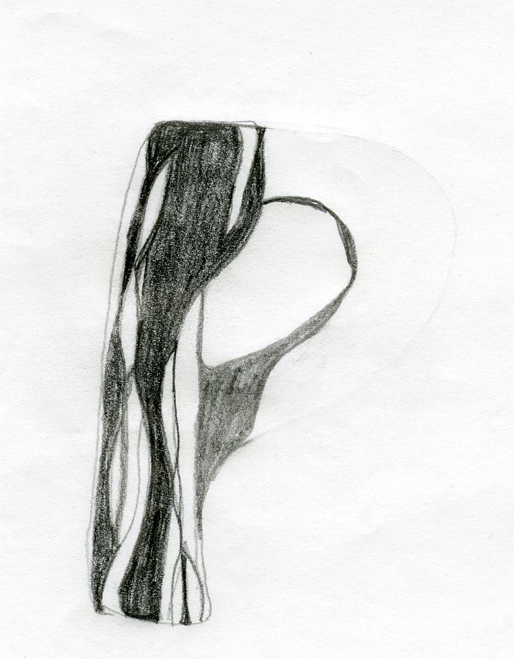
After these I went onto P then this formed R, in which I had used the same outlining method as K. From P I developed a B, I outlined this to make it recognisable as a B.


I then used I to form M, I drew the M and then traced over the detailing of the I. It isn't the exact same shape but the detailing worked in the M. M went onto N, H, T.


I then drew E and F, I decided detail was needed on the bar and I combined the two, and then  half filled the other elements.

 
C was different, I had to redesign the curve, I followed the same principles as I had for I. C then made a G and backwards it helped me form a D. C later on helped me to create the O, where I had to keep rotating the C to create the whole of the O. 


G also helped me to create Q and S in a similar way to C and O.


I then designed another completely new letterform as V, which then formed the stem,hairline and crotch of the Y and I created the tail as a filled shape. V also made an A and again I made the crossbar a solid shape. As well as this V made the U , although I had to add extra detail and V developed into a W too.


Ten I made Z, I tilted the I to create the diagonal stroke of the Z and then made the arm's from filled shapes.

This diagonal stroke helped me to create X too.


After I had completed all of the letterforms, I moved onto the punctuation glyphs . I considered each glyph and thought of how they connected to Sarah's personality. I have explained my choices in the piece below.


I followed the same principles for the glyphs as the letterforms. I created the dot of exclamation mark and the question mark. The hyphen Was formed by detail form the I as was the main diagonal component of the ampersand. The quotation marks where developed from scratch too . Each glyph except the hyphen has a filled shape and open space.


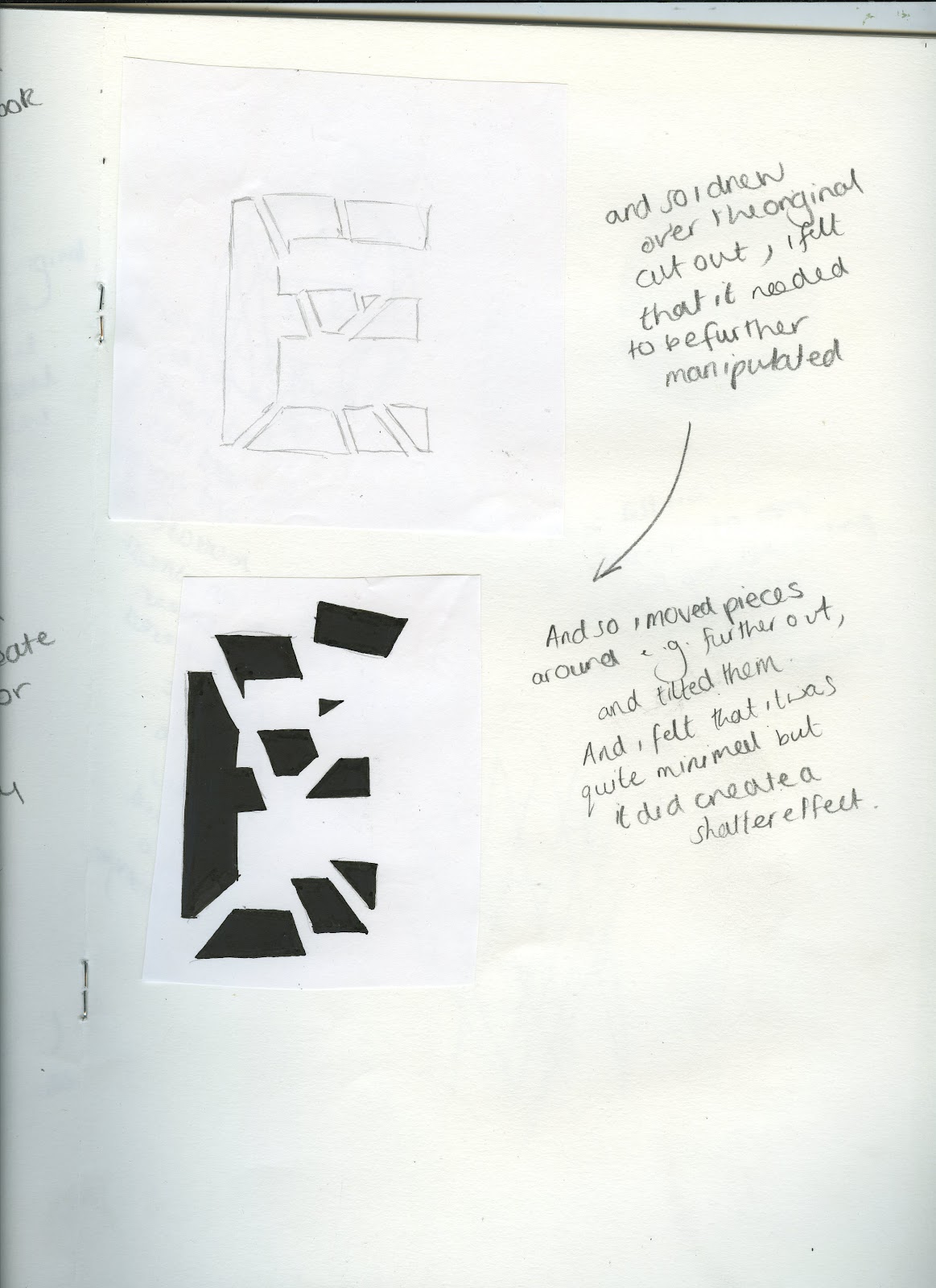
Development of final design
I scanned all the hand drawn letterforms into the computer and I then live traced them on illustrator, I then dragged them into photo shope converted them to black and white. I then used the magic wand tool to remove the white background. After that I used brightness and contrast tools to make sure the images where filled in and black. I had already set up a grid on the computer that had the same dimensions I had created on my A1 trace.
However I should of just set up a grid to fit A1 on the computer it would of saved a lot of time , as I had to cut out each letter and stick them in each square.


I then laid another piece of trace over the top of this, so that it would be completely clean and have no grid lines on it. I then traced over the letters with black fine liners of 0.2 and 0.8 thickness and the quality of the pens worked really well and created solid black lines.


Final Design
I feel that my typeface is very natural looking, it is intricate and linear. The strokes range in weights and space, and almost look like wood grain or zebra (zorse) stripes, it is flowing and curvy. I have also created a sense of structure with filled shapes, but openness by not filling in the original letterform completely, leaving it to merge into its background. 


Thursday 4 October 2012

Alphabet Soup Visual Thinking


Deliverables:
10, 10x10 hand rendered letter forms.
Only black.
A manipulation of an already existing letter form.  
Based on the concept Shatter.

In response to my research i firstly began by experimenting with cut out card to create the same effects as shattered glass. But I simplified the shapes into triangles. I then began to experiment with these cut outs and i photographed as i went along .

H

A

A

A

A

H/K

b

o

d

I

O

O


O (black and white card)

O

O (black and white card)


R

From theese images I used the original printed out typeface and traced around it i then put it over the photograph and tried to comine the two you can see this in my development below.


Originally I began with the letter S, this was because it was the first letter form in my word (shatter). From looking at my research i realised angled lines and triangles had been used frequently to create a shattered effect. And so I drew my self a grid that had lines at all different angles, and it contained triangles. I then layered my S over the top of this grid and drew over it. I then began to break the lines down into pieces and seperate the from one another.


Then from separating the pieces i began to manipulate the chunks individually , I made so bigger and some smaller , I also removed some and added some in, to create a realistic shattered look.

I then experimented with a fill and half fill to really exaggerate a broken and separated look. However my final S had no fill.


After this I considered the possibility of how minimal I could make the word shattered.


However I felt my experimentation with the letter S wasn't going further and so I moved onto my letter A, which I had really liked in my cutout experiments. But I did realize I needed to manipulate an existing letter form and so I drew over the original A and then combined it with my cutouts by extending parts of the A and making them more angular.


From my first A experiment I felt the letter form I had designed did not look as broken/ shattered as I would of liked it to and so I moved onto another cutout experiment , and i felt this worked better, although i did change the rotation of the little triangle in the middle to align with the middle part of the Helvetica A. I then filled in the letter form as I wanted it to be minimalistic and all one colour, not outlined.And this became a final letter form as well.


Next was the letter O, where in my experimentation I had placed little black triangles all on top of the original O, I felt this had made a good shattered effect and it looked quite violent and lively , something a shatter is. And so I photographed this and simply drew around the outlines, I then filled it in to create a solid letter form as above. This again was a final letter form.


I then focused one the idea of triangles again and I wanted to create a letter that contained them , and so looking through my photographs I realised by reverse experiment looked like an I , and so I used the lowercase i of Helvetica font to begin to create a new letter form. I used a lower case i as I wanted the letter form to really look like an i and I felt it wouldn't do so with out a dot at the top, also it meant i could play around with the effects i could create. Firstly I just drew the i and then drew the triangles on top , but I didn't draw into any of the shapes.


I did then however go quite minimal and removed the top of the I but I felt that the letter became abit lost, and so focusing on my original idea of reversing, I kept the dot and made the triangles white but removed the main part of the I and made the triangles black and I felt that it kept the letter connected even tough it looked quite separated and broken. Also the triangles at the top are smaller and spaces out but the ones at the bottom are bigger and close this was to create the idea that the pieces were falling as if you'd just broken a glass, almost a capture of slow motion.


Then again looking at my experiments i realised I had a b but I wanted to make this uppercase as I felt the triangles would add to the sense of shattering . And so I used a similar technique as the one above to create this B. However the triangles where more flat and looked like they had fallen on top of the B.


Then from looking at my research I remembered a particular piece where a company had made a cardboard cut out and the traced over it , I wanted to replicate this technique as I felt it created a really interesting effect and was a different take on broken i.e the pieces are shattered but you've tried to put them back together. And so I cut slits into my triangles and made them into a 3D shape, in this case the model looked like a capital R and so I used this as my letter. I traced over my photograph and tried to capture the 3D detail, however it was too chaotic with the whole outline of the R.


And so I removed the outline of the R and left the main detail and any part of the original R which was showing , this worked better it looked more fluent and connected, however I still felt it looked flat and so I filled in the remaining outline of the R so that the detail of the triangles would still remain and i really liked this effect.


Again I used a very minimal cut out experiment for my next letter form which i felt looked like a H. I drew over the two.


I then separated the lines into components, but i felt that I had already done this and I wanted to focus on the actual lines  shatter produces and so i experimented with filling in to leave lines and then just drawing the line with different pen thicknesses to create a realistic shatter.


After this I realised the epicenter was quite an important part when and object shatters and so i cut into an original letter making sure the cutting lines went through the middle.


I then drew around the whole E and included the area that weren't connected, however I felt it didn't look violent enough and so I moved some of the pieces further out and tilted some of them slightly. I thought that this worked a lot better and so I filled in the letter I had created, so that you could see it had originally been one letter.


I reverted back t my first technique in this piece, but i wanted the focus to be on the triangles , and so i drew over the letter itself and then made some horizontals to create triangles.


I then singled out the triangles and filled them in some of the shapes had to be put merged but i still felt it had created the effect I wanted.


For my last letter form I combined a couple of ideas together. I started with a lowercase a and i cut it up , i then shaped it into a capital A to create a letter from a letter. Firstly I didn't draw around each segment but I didn't think this detail was enough and so I drew the lowercase a and the segments and this created the effect I wanted.

Ten final letter forms- Shatter