
10, 10x10 hand rendered letter forms.
Only black.
A manipulation of an already existing letter form.
Based on the concept Shatter.
In response to my research i firstly began by experimenting with cut out card to create the same effects as shattered glass. But I simplified the shapes into triangles. I then began to experiment with these cut outs and i photographed as i went along .
 |
| H |
 |
| A |
 |
| A |
 |
| A |
 |
| A |
 |
| H/K |
 |
| b |
 |
| o |
 |
| d |
 |
| I |
 |
| O |
 |
| O |
 |
| O (black and white card) |
 |
| O |
 |
| O (black and white card) |
 |
| R |
From theese images I used the original printed out typeface and traced around it i then put it over the photograph and tried to comine the two you can see this in my development below.


After this I considered the possibility of how minimal I could make the word shattered.

However I felt my experimentation with the letter S wasn't going further and so I moved onto my letter A, which I had really liked in my cutout experiments. But I did realize I needed to manipulate an existing letter form and so I drew over the original A and then combined it with my cutouts by extending parts of the A and making them more angular.

From my first A experiment I felt the letter form I had designed did not look as broken/ shattered as I would of liked it to and so I moved onto another cutout experiment , and i felt this worked better, although i did change the rotation of the little triangle in the middle to align with the middle part of the Helvetica A. I then filled in the letter form as I wanted it to be minimalistic and all one colour, not outlined.And this became a final letter form as well.

Next was the letter O, where in my experimentation I had placed little black triangles all on top of the original O, I felt this had made a good shattered effect and it looked quite violent and lively , something a shatter is. And so I photographed this and simply drew around the outlines, I then filled it in to create a solid letter form as above. This again was a final letter form.


I did then however go quite minimal and removed the top of the I but I felt that the letter became abit lost, and so focusing on my original idea of reversing, I kept the dot and made the triangles white but removed the main part of the I and made the triangles black and I felt that it kept the letter connected even tough it looked quite separated and broken. Also the triangles at the top are smaller and spaces out but the ones at the bottom are bigger and close this was to create the idea that the pieces were falling as if you'd just broken a glass, almost a capture of slow motion.

Then again looking at my experiments i realised I had a b but I wanted to make this uppercase as I felt the triangles would add to the sense of shattering . And so I used a similar technique as the one above to create this B. However the triangles where more flat and looked like they had fallen on top of the B.


And so I removed the outline of the R and left the main detail and any part of the original R which was showing , this worked better it looked more fluent and connected, however I still felt it looked flat and so I filled in the remaining outline of the R so that the detail of the triangles would still remain and i really liked this effect.

Again I used a very minimal cut out experiment for my next letter form which i felt looked like a H. I drew over the two.

I then separated the lines into components, but i felt that I had already done this and I wanted to focus on the actual lines shatter produces and so i experimented with filling in to leave lines and then just drawing the line with different pen thicknesses to create a realistic shatter.

After this I realised the epicenter was quite an important part when and object shatters and so i cut into an original letter making sure the cutting lines went through the middle.
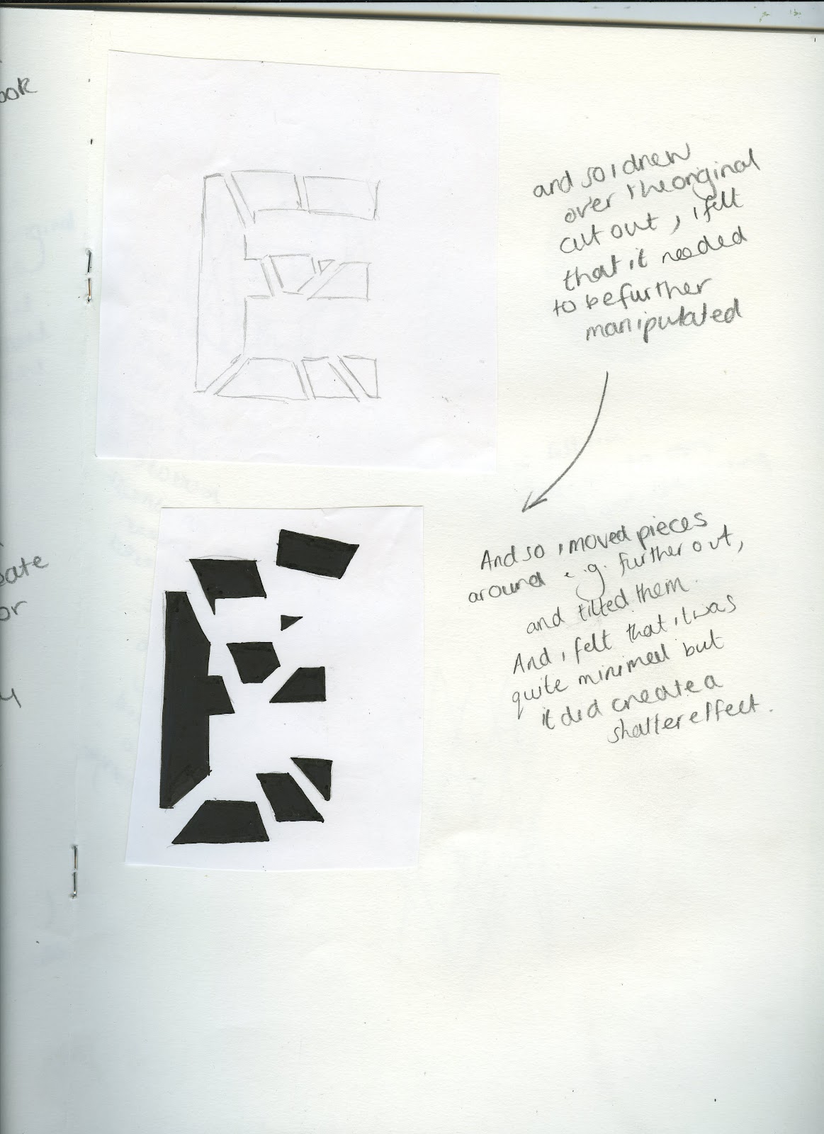
I then drew around the whole E and included the area that weren't connected, however I felt it didn't look violent enough and so I moved some of the pieces further out and tilted some of them slightly. I thought that this worked a lot better and so I filled in the letter I had created, so that you could see it had originally been one letter.

I reverted back t my first technique in this piece, but i wanted the focus to be on the triangles , and so i drew over the letter itself and then made some horizontals to create triangles.

I then singled out the triangles and filled them in some of the shapes had to be put merged but i still felt it had created the effect I wanted.

For my last letter form I combined a couple of ideas together. I started with a lowercase a and i cut it up , i then shaped it into a capital A to create a letter from a letter. Firstly I didn't draw around each segment but I didn't think this detail was enough and so I drew the lowercase a and the segments and this created the effect I wanted.
Ten final letter forms- Shatter


No comments:
Post a Comment