Sunday 27 April 2014

Jackson Rising Part 3

As an additional task we had to go away and produce a different medium for the exhibition information, for this I decided to do a ticket, I've not really worked with tickets , but for a separate upcoming brief I know I will be producing my own ticket for an event and so I could use this task as practice for this. 

I decided to keep a similar look/ style for the ticket as I had done for the flyer and brochure,  I wanted them all to work together as if they where actually part of a set. 

To keep coherence I added the same off-white box to my ticket, as well as this I used the same logo, and the same typeface. 

As for the information on the ticket I was unsure what information would be needed on the ticket and so I searched exhibition tickets, I found one from the Tate and I felt that this information would probably be the most like a ticket for the MoMa. And so I picked out information from the ticket to use on my own. I used some content from my flyer and brochure and I also made up my own. 

I set the date of the ticket to be the opening night (3/8/14) which is a sunday, and so I stated on the ticket that the visitor has to arrive 30 minutes before opening as it would be opening night and they would want everyone to be their a little earlier. 

I also looked on the MoMa website at how much normal admission is and I found it was $25 for adults and so I used this information on my ticket. 

http://www.moma.org/visit/calendar/tickets/2015/02/01


I also added the barcode and perforation to the ticket just as a ticket would usually have to admit visitors. 

I am happy with the range of mediums I produced for this task and I was surprised at how fast I could produce them. I also think that all three are coherent and I like the style I had produced. 

Thursday 24 April 2014

Jackson Rising- Part 2 Brochure

The second part of the Jackson Rising Brief was to create a concern brochure, we had the rest of the day to do this. (until around 3pm)


Jackson Brief 2:
Background:
This text/image heavy layout will ask you to utilise body copy, title, date, and location, heading, sub heading, imagery, indexes, highlighted quotes. The amount of text allows for the use of imagery and the type to serve as the main visual elements.
Brief:
You are to layout and design a 10-page concertina folded brochure for a forth-coming exhibition titled ‘Jackson Rising’ at MoMA, New York. All images, copy and branding are included. You have to create a visually stimulating layout that showcases the artists’ imagery but does not sacrifice important information in this process. The images and information must flow harmoniously and offer a taste of what is to be expected during the exhibition. 
Branding elements must be kept to black and white. Images must be unaltered and in colour.
Considerations:
Headings, headlines, body copy, grid, type, colour, image sizing, bleed, margins, flow, audience, narrative, language, purpose, size, external print methods, preparing for print, stock, distribution.
Specifications:
Format: A5 x10 – Portrait – Concertina spread (front and back).
Title: Jackson Rising - Curated by Jenny Dowd
Dates: August 3, 2014 - August 31, 2014
Location: 11 W 53rd St, New York, NY 10019, United States

We where also given statements made by the artists, and images of their work,  we had to include these but we could edit how much we where going to put in or leave out.
Firstly I decided that my leaflet would open in a portrait orientation (downwards) I had decided this after being shown a few examples of concertinas previously, I thought that this orientation was interesting, as well as this I was currently working on my research publication which was also concertina but it read horizontally, and so I wanted to try this different layout. 
There where four artists, I wanted the brochure to be fair and so I dedicated two pages (so two A5 pages) to each one. 

Like my flyer I decided to keep the off white running though the brochure meeting the break in the type of the logo, except this time the ratio was more like 1:3 over 2:3 like the flyer. 
For the front cover, I used the same alignment as the flyer, so it would be coherent, I also remembered to added the dates of the exhibition ! From the front cover I like the way the copy was in a small column, I pushed this through to the rest of my design. 
All the artist images where in the same two sized boxes, one was a rectangle the other a square. I tried to make the work look interesting and I used different techniques to do this for each artist. Yet I still kept a clean layout, as I wanted the brochure to be professional and modern. I followed the margin of the brochure and this made a succinct linear feel, this was also helped by the strip of colour aids this, and it makes you want to read along the pages. 

For all of the type I used Gill Sans MT, in regular and bold (for headers) I felt that this font matched the font of the logo the best and they worked well together. I included all of the copy the artists had given as I felt that this was the fairest thing as a designer to do, this way the artist wouldn't be disappointed. 

I also had one page left, and so I made this into a content-like page, and so on this page I listed the all the artists, I arranged the artists names in alphabetical order, and I indented each name so that it would fill up equal space on the page.

Overall I was again really happy with what I had produced for this task, I didn't feel like I really needed to change anything and liked the layout I had produced, I also enjoyed working with the format and the orientation. I think that the brochure would be appropriate for the audience and I think the way I chose to showcase the artists work with different techniques adds a little bit more interest, it also shows off their work.


Jackson Rising Part 1- Flyer

The task for this day would be to see what we where capable of producing in one day. 
It was also to test our layout skills and inDesign skills. 

The first part of the task was to create a flyer.

The task was based upon an art exhibition named Jackson Rising. 

All the elements where given to us on a file, this included the logo. We where also given the type we needed to include. 

We where also told the specific/ strict colour scheme, which was black, white and off-white. 

We where told to set up an A5 document on inDesign and make a flyer for this exhibition, in  half an hour.

Here is my final flyer:


I had found the logo difficult to use, it had strange angles and it was unbalanced, however I made it the largest element on the page and centre as it is the most important thing. 
I liked the way the logo was broken up and I decided to play with the broken up lines within my layout.
And so I placed all of my information to the right-hand side of the poster, I did this as the logo becomes thiner at the right , whereas the left takes up more space. 

The copy and the curator information was placed above the logo this acted as an introduction, and I highlighted the curator details by making the type bold, this almost acts as a signature I felt that this was a second or third most important detail for the audience to know. 

I also split up the two logos, MoMa I placed at the top at this is the actual venue, and the NYU logo at the bottom as this was its sponsor.

The main element of this flyer though is the coloured box I added, this was in the off-white colour. I think it really draws your attention, more so than a black and white flyer. I worked along the break of the letters in the logo. It is also almost 2/3 of the way across from right to left, as to make the poster visually coherent the type was also right aligned, and so this made sense, as well as this the 2/3 to 1/3 ratio is almost the of the golden ratio and this is why I made the box the size it is. 

My poster was picked and shown to the rest of the group, this made me feel quite confident in what I had designed and I was happy at what I had produced in half an hour. 

The feedback it received was mainly good, 
I was told that I should put the logos together and make them smaller, and I did this later on, and it did look better everything was more orderly. 

Revised Flyer:


PPP Group Presentation

As part of the group I nominated myself to put together the presentation, everyone was happy for me to do this as well. 
I did this as I felt like I wanted a little bit more involvement in the group. 

Doing this meant that I could gather all the information from everyone together and put it together in a presentation. 

I began with an introduction, I went for this layout, I felt that the type would sit interestingly here and I could put the logo in the top right, as in the following slides. 

From looking at various websites that where a the same design agency as we wanted to be I looked at the type and the wording they used. I noticed that they used a serif italic font, and I feel that is very appropriate for the design fashion sector. 

And so I used georgia italic as the font for the presentation. 
I made the wording precise and professional, I also followed the advice from John. 
As well as this for the structure of presentation I looked through my own notes and decided what we needed to say. 

This is the basic structure I came up with:

  1. Introduction
  2. Where are we based
  3. What type of work do we do
  4. Intended Market
  5. How we work
  6. What sort of business we are
  7. Financial Breakdown


When there where images they where in place of the text box (as below) 


The presentation follows the style and aesthetic we had decided we wanted our company to be. I think it is appropriate, and I feel that we covered a range of areas to do with the brief, and our business comes across well. 

Seam- Final Presentation Boards

Wednesday 23 April 2014

End of Module Evaluation

1.  What skills have you developed through this module and how effectively do you think you have applied them?
The main skills I have learnt and developed is my presentation skills. I applied my presentation skills by creating a range of design boards displaying different work; I improved upon these skills by learning from others and having my own work critiqued. I would also say that as I had nine briefs I had to create nine sets of design boards and I feel that the amount I had to create gave me more and more experience, I think that from having this experience and new skill I created a good set of boards for each of my responses.
I have also improved upon my brief management skills and the ability to not just concentrate on one brief at a time, this module really pushed me to divide my attention to a range of different briefs and even though I am still not entirely comfortable with this I think I have vastly improved and I managed to answer nine briefs which I am pleased that I managed to do.

2. What approaches to/methods of design production have you developed and how have they informed your design development process?
I think that one of the main methods of design I have improved upon in this module is my Photoshop skills and knowledge in particular using this software to create mock-ups. I have learnt so much about templates, layers and smart objects, at the beginning I had relatively no experience in this area of design and now by the end of this module I feel quite confident when creating mock-ups now and I have even helped others. Learning these new skills enabled me to create new visuals that I wouldn’t of done before, also creating mock-ups meant that I could expand the range of my design without any extra cost but it would still show what I wanted and needed to, I think that this has been one of the most valuable things I have gained from this module and I am sure that I will continue to do this.
Another unexpected approach to my design production that I have used and improved upon in this module is my illustration skills, being both digital and hand-rendered. My response to the Body Shop brief really pushed my illustrator skills and I created bright/ colourful/ highly illustrative pieces, I would never usually go into that much detail and so I learnt that I could do it, but I also learnt that I don’t particularly enjoy working in this way. As well as this I answered the Cath Kidston brief by hand drawing/ painting my ideas, this improved my hand-rendering skills and combining it with digital editing made my design work really well, again I feel that I have learnt that I do not particularly want to produce work of this nature again.

3. What strengths can you identify in your work and how have/will you capitalise on these?

I feel that in all of my briefs I have created strong, well thought out concepts, I created them with meaning and thought, and everything had a purpose behind it, I think that I am quite strong in my conceptual development and I will continue to create thoughtful design and work, which will make a range very strong.
I also think that one of my new strengths that I have developed within this module is my presentation skills, or presentation boards, this module really helped me to explore this and I feel happy with every set of boards I created in response to each of the briefs, I will use this new skill and continue to achieve high standard presentation boards, and final work boards, so that I can showcase my work to its full potential.

4. What weaknesses can you identify in your work and how will you address these in the future?
In this module, I feel that I did not create a lot of printed work, this might be due to the nature of the briefs I chose but I feel that if I had more printed material I would have had a wider range of outcomes and my overall work would be stronger for this module. In the future I will try to not pick a lot of briefs that only require digital work, so that I can explore print a bit more.
I also think that my blogging skills aren't particularly strong, at the start I completely forgot about blogging and throughout I felt that I concentrated on the creation of my work and got slightly carried away without thinking about showing my development process, or more importantly talking about it, in the future I will try to blog as I go along, so that my development process is shown better and that I can reflect more upon what I have done, and others can see this too.

5. Identify five things that you will do differently next time and what do you expect to gain from doing these?
Start from the beginning, I need to start my modules/ briefs immediately when they are set rather than concentrating on other work/ modules that I am currently working upon, that way I will be able to start other briefs quickly and have more time for other things, as well as this a similar thing I will address is my selection of briefs, I again need to do this quicker than I did in this module, I feel that I didn’t select briefs imminently as I was overwhelmed by the choice and the wording on the briefs, by doing this I hope that I will gain more time to produce a better quality of work and a larger quantity.
I also would choose more wisely, for instance when selecting a brief I need to be more careful with my selection and really read what they are asking for and work towards design that I want and like to produce, from doing this I hope to gain stronger outcomes and maybe even ones that will win! As well as the selection of briefs I also need to consider my choice of who to work with, I think that if I made a more considered choice then I would have an equal partner who would take on an equal role in the work load etc. I also would like to work with someone who has similar interests but different skills so that I could learn from them and we could possibly create something really strong.

Attendance- 5
Punctuality- 5
Motivation- 3
Commitment- 3
Quantity of work produced- 3
Quality of work produced- 4

Contribution to the group- 3

Summative Evaluation

Project Report

Oasis- Individual Input Boards

Individual Practice Brief- Final Boards (Body Shop)

Tigerprint Black and White Surface Pattern Final Boards

New Look (Shoe Department/Back of House)

Sky Deck Final Boards

Loft 310 Final Boards

Illy Final Board

Cath Kidston Final Boards

Classic & Iconic Cars Final Boards

Oasis Final Collaborative Boards

Oasis Final Collaborative Boards

Thursday 17 April 2014

New Look

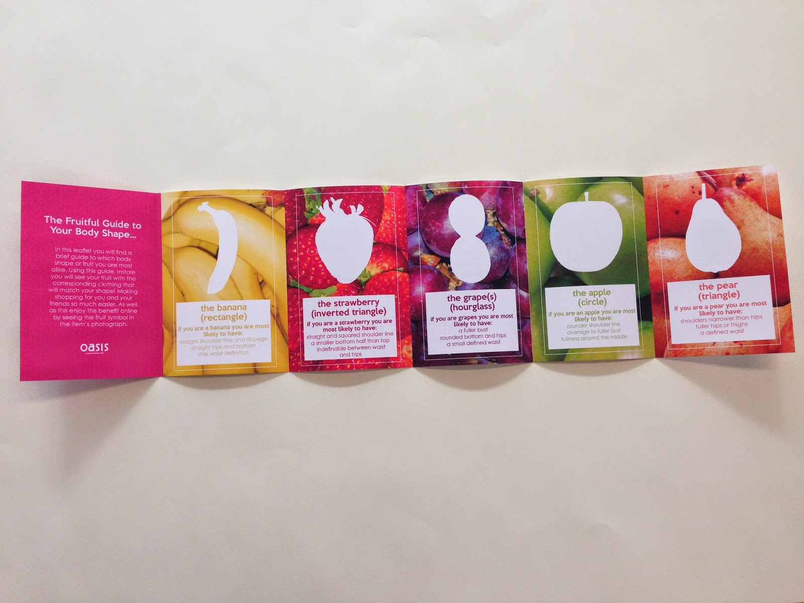
Firstly for the posters I wanted to name the department, I noticed that on the shop floor that a couple of signs said 'shoe heaven' I thought that I could use this name to name the department as it isn't played upon enough as well as this it is a positive message and I wanted the audience of the posters to feel positivity when reading the list of rules rather than a long negative/ boring list.

I picked a font that varied in weights, it also adjoined and was quite rounded it looked quite girly and fun and this is why I chose it, plus it was more of a header font, rather than body copy, I felt that it would stand out.

Font: RiotSquad
Source: http://www.dafont.com/riotsquad.font


I felt that the type wold look even better if it was like a logo almost branding the department I simply added a ver closed ellipses to look like a halo, I think that it emphasises all the connotations of heaven, and heavenly, it is quite positive. 


I then laid out the first poster, which would contain all of the rules (as decided by existing staff) I decided to sum up each point with a simple sentence/ subtitles and then underneath explain further what the point meant. I think that I did this quite successfully, and I felt that the points where easy to follow and to remember. I had created an easier way to follow all of the demands the shoe department has.

Each of the points where numbered, we decided upon 10 as 10 is a regular number to use for a list of rules, I also made each of the subtitles the same font as the title, I think that the font adds a bit of visual difference and they stand out more in case the poster is read really quickly these points would be the first seen, they are easy to absorb.

Everything is central as the logo I created is central, as well as this the copy fit the best in this alignment, it is easy to read from top to bottom. I also added a thank you message at the bottom to make it a bit more personal and friendly.


I then decided to create the other poster, which would explain/ show the idea of size ordering.

I chose a high heel to show this concept, I think I chose this style of shoe as it is clearly a shoe and it is style of shoe that is one of the most stocked in the store.

I drew the shoe by finding a photograph of a shoe, and then using my pen tool to draw around it, I wanted the shape to be pretty accurate as I wanted it to be really clear.

I went for a linear black an white style as I wanted it to look quite info graphical.


I then duplicated the shoe to look like a pair, shoes in the store are on the shelves in pairs. 

Shoes are also put out in set of eights on one shelf and so I showed eight pairs, I also drew the shelf, in the store shelves are rectangle , thick pieces of acrylic , this was perfect to draw for my illustrations and so I did. Again giving it a similar style to the shoe. 


I then put the shoes onto the shelf..


I also made a separate illustration where I numbered the shoes along so that I could show how it worked. I placed the numbers between the shoes and the shelf so it is like when you pick up the shoes and underneath them on the sole is the size, as well as this it connects everything well, shoes to shelf. 

On this poster I showed both illustrations, slightly like an instruction manual would, it showed the final piece smaller and the details of it larger, I also wrote a short explanation explaining the system, and the title is 'size ordering', with the logo I had designed above, almost like a branded training programme.


Final Poster...
I feel that it visualizes the process well, especially if a new member of staff didn’t have time to be shown or they had forgotten. 


The branded side gave me an idea for how I could further this project, what I could suggest. Not only could there be more illustrations in the range and maybe even an instruction manual, I thought I could push the idea even further.

I thought that all of this could go into an app which could be accessed on a smart phone or tablet. Staff would use their ID to log in and train, currently the system New Look uses is on the till and this can take up time, plus it is harder to update. An app could have all different modules on and could be updated when new service theories are brought in. It would all be secure with a login and would be accessible from anywhere. The store could have tablets in order to do this but as well as this tablets can be used for other purposes in store and so this is more resourceful. 

At first I made a very simple mockup 

By just using the information I already had but I don't think that this shows my idea very well. 


However upon reflection I decided that I needed to show the things I have mentioned above such as the login the manual and the training screen and so I have done that below...


I am happy with the original posters and the idea that I came up with which could further the training system, I think that if I had more time I would work mor upon the look of the items in the mock-up.

Tuesday 15 April 2014

Final Posters for Oasis

These are the final nine posters/ service messages I had designed for the Oasis brief, after a few experiments wight he layout this was the final outcome. 

Two of the posters where banana themed, two where pear, two where strawberry, two where grape and the last was apple themed. This was chosen like this as the we had picked the most appropriate sayings, for each message.

The layout of these posters is central. All the type is in a white circle this is because white stands out the most against the vibrant/string photographic background. We had selected the colour of the type to be the same as the a colour from the photograph and each fruit shape would be also represented by this colour for instance banana, is yellow, strawberry is red etc. 

The fruit themed saying is the largest type element on the page, this is because they are different they would capture the attention of the audience, they are also directive and act almost like a question, you want to know more and so you read the subtitle/ body copy which is the actual message set by Oasis. This service message acts as an answer, its almost like a problem solved, which is what the service messages are, they're supposed to make the audiences life easier, and their shopping experience better. 

Each message has punctuation, this leads the audience, gives them a thought makes them want to know more. 

I placed the oasis logo at the top of the circle, so that the poster had a more upwards feel making it more positive and balanced, (all the type isn't at the bottom then)


Oasis- Further Print and Digital Deliverables


Body Shapes Advise Leaflet
The purpose of this leaflet is to help customers to decipher what 'body shape' or 'fruit' they are most alike. This would mean that in-store they would be able to shop their shape and they could also do this online with visual cues, such as the single fruit symbol.

The leaflet has each of the fruits and a quick summary of come of the characteristics of that body type. 


Final Printed Leaflet.

On the reverse I designed it very simply, when seeing the print you can see the copy better. The copy on the back matches each shape which is on the front, they are also the same colour as the fruit copy that had been selected. 
The copy states the shape but has a positive message along side it for instance: 'green with envy for ; apples' the copy also matches the type of the fruit labels designed by Melissa, meaning the first line is the copy font (from the posters) and the second line is the header font. 


The inside of the leaflet is very vibrant and eye-catching, I used the fruit photographs as the background for each, I also used the white outline of the single fruits that I had done on photoshop this is to emphasis the look of the body shape. I then added a white box at the bottom of the symbol and wrote out a few aspects of that shape as well as the fruit name and shape name, this is one of the only times these have been put together and so for the customer to fully understand this would be quite an essential part of the whole concept. As well as this I wrote an introduction which explains the process of fruit to body shapes, and it also explains how they can use this in store. 

(Which is through labels with the specific fruit/shape on them on the related or appropriate clothing so that the customer could shop their shape) 


How the leaflet works...
It is a pocket sized guide that opens out into the five shapes, it does this by continuously folding outwards, it is not a concertina and it would not work in this way. 


Overall I think that the leaflet is successful and I think it is an appropriate and necessary part of the overall idea of the messages. I feel that the inside of the leaflet is much stronger than the reverse, it is vibrant like the posters, and I think it explains the concept well. However I do like the reverse its simple and too the point. Throughout the leaflet and the messages there is another underlying message of positivity, it doesn't say one shape is better than the other it simply helps women of all shapes and sizes, and the leaflet does not state that that shape is necessarily what the person is it just gives them advise and so it is not directive or to the point meaning its more like a friendly advise services, which is what customers want really. 


As well as the print side of the brief I also looked into the online/ digital aspect. I thought about how the concept could work online, and how may the messages work too. 

And so I looked online at the oasis website, I saw that they have a rectangular image and a square one like a 2/3 and 1/3 format. I thought that the messages would easily sit in these spaces and they could range in position and which message was being displayed. I thought that the nine messages could be on a rotational basis and each time the home page was selected a different message would show. This would just remind the audience of what the store has to offer and it may encourage them to come to store as they have more services and more personal services than online has to offer. But its not to discourage online shopping either. 


With this in mind I developed a simple way that the messages could also encourage online shopping. This would be in the form of a small fruit symbol next to the item of clothing it was appropriate for. I also thought a more advanced way that this could be used is that the symbol could be filtered and every item of clothing appropriate for that shape would appear, whether it be tops, trousers, skirts, dresses etc.


So for instance the fruit symbols would be in-between the information of the name of the item, and the price, the fruits would vary when unfiltered and all different fruit symbols would be visible. This is so anyone could see the variety the store has to offer. 


Closer up...

When the item is select a larger information box appears, I placed the fruit symbol in the top right hand corner aligned with the name of the item and price, this is clearly visible yet un-distracting to the actual information, it acts as a reminder. The fruit symbol is also larger than before as the information itself is larger too, I also wanted the symbol to be really visible.


(All Mocks together)
These mockups where on the original boards but after a final crit before we had to submit the response to YCN, it was said my a few people that the boards where too crowded, I looked back on the boards I had designed and I felt that these comments where fair and so I separated the online/ digital mockups into three.

(I decided to show the digital responses across a range of devices as I felt that the audience would either own a computer or a laptop, or both, and a large percentage of them would own a smart phone.) 


1. How the fruit symbol works online... 


2. The messages displayed online...


3. Social Media...

I also thought about how the concept would work on social media sites- after all one of the messages states that oasis loves social media.
And so I mocked up an instagram post, where @oasisfashion would post new items or items that where appropriate for the fruit shape they where writing about for instance what I had written as an example was ‘absolutely pear-fect’ for pear shapes. But instead of just these kind of posts Oasis could show celebrities and their shapes and use the hash tags to show this. For Facebook the time-line would simply change fruits and messages every week, And twitter could act in the same way, but Oasis could also tweet about new arrivals etc. 


Facebook