The page size should always be the trimmed size of the print e.g. if its A5 it is set up as A5
Bleed - compensates for any inaccuracies of the print
3mm is a standard measurement
Slug- is used for printers marks/ fold marks/ crop marks
Primary Text Frame- Will put a text frame on every page
for saddle stitch bind, the number of pages has to be a multiple of four
Document Setup will allow you to change any of the choices from a new document
If you need to find the swatch palette
Swatches show as a mixture of inks
When working with text in the swatch palette a small t appears this means you can change the colour of the text using this icon
(not advisable to change the stroke of the text, it could affect the legibility of the letters)
swatches are named with their colour values (percentages of ink)
they work like the swatches in illustrator, the grey square means they are global, by editing the swatch the whole colour scheme can be changed , across multiple items of that colour
it will also change on all the other pages
Spot Colours
change the colour type to spot
then in the colour mode all the spot colour libraries will appear
You can search for any colour using the reference number bar
The name needs to remain as its reference
The square colours have now changed indicating that it is a spot colour
Tints
The percentage shows of the tint
You create these by selecting your original swatch and then using the tint slider
And then click new swatch
Preparing images for InDesign on
Photoshop:
- make sure that your image is in CMYK colour mode
- its at actual size (making them bigger will loose quality, smaller will result in extra processing)
- 300 dpi
- tiff or psd file type (JPEG may result in extra processing, and it loses quality each time, psd allows you to keep your layers and transparency )
Illustrator
- CMYK (make sure the colours that have been applied within the document are all CMYK, as you can work with both)
- save as an ai (you can copy and paste into indesign)(never do this with photoshop)
File >
Place
Will place your image at its exact size
The spot colour(s) moved over with the document
this will also happen for illustrator documents
What happens once you have sent your document to print
When you turn on the view of the separations, ti shows you the image at its full quality, the same as going to over print preview
You can see there is no difference between the two images, this means that you would be paying for a plate and ink that you didn't need.
You can see how the image will be built up through the printing process, as if they where separate plates
delete colours that aren't being used before sending of to print
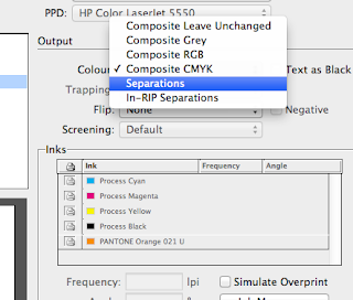
Separations, so you can print each positive for each colour separately e.g. for screen printing, commercial print
printer has to be black and white
You can select which ink you want to print, using the printer icon
the frequency and angle can be manipulated in order to produce half tones- tints in print
Moiré patterns can be made manipulating the angles
overprint preview
knocking out
when one colour prints over another and it is blank where the other colour meets
overprinting
black will always overprint
you can change your colours to this overprint option by going to
window>
output>
attributes
and selecting overprint
useful for screen print , and so that you can see this
e.g. overprinting mixes the inks and you can get a third colour for no extra cost
you would need to speak to a printer about the availably of this option though
spot colours can specify a spot varnish
you can use a pantone and tell the printer that that process will be a spot varnish and not a colour
you can only see how the inks are going to overprint / knock out when the overprint preview is on


