Tuesday 31 December 2013

Design Production: Concept Workshop

Concept

  • A plan or  intention
  • An idea or invention to help sell or publicise commodity
  • Something formed in the mind, thought or notion
'357' 'ThreeFiveSeven'
By Wanda Priem, she turned her surname into prime and then played on the concept of prime numbers. Prime also meaning quality. Prime numbers can only be divided by themselves or one, perhaps suggesting individual work.
She also devised a grid system using the prime numbers and this is a feature of her work.


We where put into groups we where then told to choose three words from Jar 1 and one from Jar 2. 

Jar 1 (Nouns that we had to develop a concept from) -
Block
Book
Test

Jar 2 (Determined what the concept was for from the choices; bar, hotel and restaurant) -
Hotel

We then, as a group, did a diagram/ word association with each of the three words that had come from jar 1.


We chose to go with the word BLOCK, as we had derived from that word something to work upon. 

BLOCK - block party - party - after party - hangover

And so we decided to work upon a 'hangover hotel' 

We then drew up another diagram to help us think of our audience and what they would need and also a stronger concept. 


We decided that our audience was anyone between the ages of 18-40, and specifically people who wanted a night out in leeds, especially people from neighbouring areas like huddersfield, wakefield, barnsley e.c.t places where a taxi home is too far and hotel check ins are inconvenient as there check out times are too early. And so we would have check in late.
As well as this the audience need somewhere where they can relax after a long night out, they need a place to recover and feel back to health. 
We decided that the hotel due to its nature should be based upon a 'rough luxury' because we wanted the cliental to feel comforted and be waited upon but at the same time they might be feeling rough and they aren't actually royalty so its almost tongue in cheek.
An so all our aesthetics would be based upon this...


The name we came up with was 'Remedy' and we made it look like an upmarket hotel logo, like below ...


Sunday 15 December 2013

Not Just Fleurons Final Brief 1

The Brief       
Not Just Fleurons

Concept/Proposition           
Design a new store that sells terrariums. Aimed at young adults it needs to capture their interest and encourage the younger audience to grow plants, for the benefit of themselves and others. The store and all the products need an identity and their needs to be a name.
Focus on the idea of miniature, and minute gardens.
A lot in a little.
           
Background   
Gardens and plants are a popular interest amongst young adults as they are seen to be a ‘older’ interest, but plants are good for the environment and themselves. They produce oxygen and they are decorative, also they have a small amount of responsibility, but still teach the same trait. Terrariums are a popular garden style because they require little maintenance to flourish, yet have an endlessly elegant look. People need to add a little green to their indoor space, with an eye-catching terrarium.
           
Target Audience       
Young Adults, who have recently moved out, probably a little bit short of money, perhaps not entirely healthy, and the house might not be very decorated I.e. if it’s a semi permanent place where they are or if they have just moved in and haven’t been able to buy decorations. They are likely to be young professionals, or university students. And they are both male and female. i.e. ages 18- early twenties.

Considerations
The types of plants
The types of containers
A name and Identity
Where and how the audience will interact with the product
Cost

Mandatory Requirements
Print
Research and Development
Specifications/ Grid
Dummy/ Prototypes
Presentation (DESIGN BOARDS)
Website mock-up

Tone of Voice
Fun, encouraging, simple/ basic terminology (of the plants etc.), and quick to the point information.
  
Deliverables
A name
A logo
An identity
Glass containers
Packaging for the container
How to / step by step guide
Tips guide/info
Types of plants guide/ plant range in store
Labels for the plants
Charcoal packaging
Potting soil packaging
Small watering can, trowel, spade
Labels for the above
Gloves
Starter Pack – including all the above- box or a bag
Shop Bag
Staff T-Shirt / uniform
Reciept
Buisness Card

Mock-up of a Shop
Letter Heads
Envelope
Compliment Slips
Invoice document

Thursday 5 December 2013

Car Business Logo Development


For this logo, which was for the classic car industry, I did some initial research and looked into classic cars, and specifically at their logos, which have a distinctive look, simple and recognisable. They consist of a shape the name or a number mainly.


And so I did some initial sketches , using the name I had developed with my dad , Classic and Iconic Cars Limited. 


Using the sketches I liked I digitised them on illustrator. I liked the 'I' and the 'C' to make a wheel like shape.  

However the design looked too rounded and didn't look traditional/ classic. 


So I changed the 'I' to a serif. I then made it larger than the circle. And I made the 'C' only have one opening, so that is clearly a c. 


I placed the name of the company under the logo I had designed. (The C and the I) This type spans further that the serif of the I, but its not wider the width of the C and so it sits neatly in-between the two.  I used Gill Sans for the typeface, this is so the logo incurs no font usage rights, and I felt that this font (all in uppercase) was well balanced and matched the look of the logo. 


Wednesday 13 November 2013

Creative Suite Session 3 : InDesign

InDesign

The page size should always be the trimmed size of the print e.g. if its A5 it is set up as A5

Bleed - compensates for any inaccuracies of the print
3mm is a standard measurement 

Slug- is used for printers marks/ fold marks/ crop marks

Primary Text Frame- Will put a text frame on every page


for saddle stitch bind, the number of pages has to be a multiple of four

Document Setup will allow you to change any of the choices from a new document


If you need to find the swatch palette


Swatches show as a mixture of inks


When working with text in the swatch palette a small t appears this means you can change the colour of the text using this icon
(not advisable to change the stroke of the text, it could affect the legibility of the letters)


swatches are named with their colour values (percentages of ink)

they work like the swatches in illustrator, the grey square means they are global, by editing the swatch the whole colour scheme can be changed , across multiple items of that colour

it will also change on all the other pages 

Spot Colours 
change the colour type to spot


then in the colour mode all the spot colour libraries will appear


You can search for any colour using the reference number bar


The name needs to remain as its reference


The square colours have now changed indicating that it is a spot colour


Tints 
The percentage shows of the tint 


You create these by selecting your original swatch and then using the tint slider


And then click new swatch


Preparing images for InDesign on 
Photoshop:

  1. make sure that your image is in CMYK colour mode
  2. its at actual size (making them bigger will loose quality, smaller will result in extra processing)
  3. 300 dpi
  4. tiff or psd file type (JPEG may result in extra processing, and it loses quality each time, psd allows you to keep your layers and transparency )
Illustrator
  1. CMYK (make sure the colours that have been applied within the document are all CMYK, as you can work with both)
  2. save as an ai (you can copy and paste into indesign)(never do this with photoshop)
File >
Place 
Will place your image at its exact size
The spot colour(s) moved over with the document


this will also happen for illustrator documents 


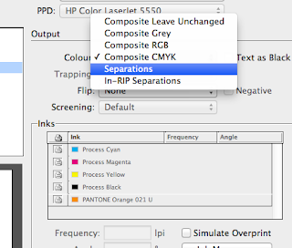
What happens once you have sent your document to print 


When you turn on the view of the separations, ti shows you the image at its full quality, the same as going to over print preview


 You can see there is no difference between the two images, this means that you would be paying for a plate and ink that you didn't need.


You can see how the image will be built up through the printing process, as if they where separate plates


delete colours that aren't being used before sending of to print


Separations, so you can print each positive for each colour separately e.g. for screen printing, commercial print
printer has to be black and white


You can select which ink you want to print,  using the printer icon


the frequency and angle can be manipulated in order to produce half tones- tints in print


Moiré patterns can be made manipulating the angles


so you know which positive page is on the marks and bleeds option you can select page information, and it will tell you the colour below or you could use the slug area yourself

overprint preview

knocking out 
when one colour prints over another and it is blank where the other colour meets

overprinting
black will always overprint

you can change your colours to this overprint option by going to 
window> 
output>
attributes

and selecting overprint

useful for screen print , and so that you can see this

e.g. overprinting mixes the inks and you can get a third colour for no extra cost
you would need to speak to a printer about the availably of this option though


spot colours can specify a spot varnish

you can use a pantone and tell the printer that that process will be a spot varnish and not a colour

you can only see how the inks are going to overprint / knock out when the overprint preview is on