For my final publication I have decided to make a magazine, this is because what I am looking at is a magazine, and I felt it was the most appropriate, and I wanted to create double page spreads, so that I could create an editorial piece. And I was also going to create a package that the magazine would be in , and I wanted to screen print onto this packaging. I wanted to package the magazine to give the impression that it had travelled. This is because Colors magazine is about the world.
I began by reproducing the Colors magazine logo/type I did this on illustrator. Firstly I looked for a similar font online I found that Gotham was similar and so I downloaded this font and used this for the word 'colors' I then added in the two circles and grouped them together and this created my final image/ logo.
I then began by designing my first page / back of my packaging. Which you would reveal when you lift up the publication.
This gave me an idea for the front of my package, I came up with the slogan who cares, which is a a play on the idea that the magazine cares, and we should care, about the message inside my publication. I also found that the colors logo is also shortened into a C and a circle in the middle, and so I manipulated the C on cares into this logo and so it connects the whole Colors branding together.
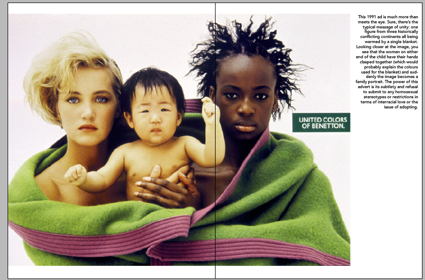
I then moved onto a page inside the magazine. I wanted to firstly explain where I had found my initial inspiration which was from a united Benetton of colors ad from 1991, and when I had looked further I had found that this had inspired the company to create a magazine dedicated to raising awareness, and being slightly controversial.
I decided that I was happy with the spread below, I had aligned the quote and the image to the margin along the bottom of the page. I wanted the image to really capture the audiences attention and so I made it just bigger than the whole width of the spread divided by 1.62. And then I wanted a clear space between the image and the copy and so I justified all my copy right. As well as this I made the quote slightly larger in point size and I also but it in the 'colors' font (Gotham) that I had found and selected earlier. As it was directly related to colors.

I then moved onto my next page, which was also continuing the message that the idea for the magazine had come from Benetton's advertising campaigns. And so I had looked through some of the other advertisements and I felt that the one with the hearts summed up the message really well. I decided to illustrate these hearts by drawing around them in illustrator with the pen tool, I felt that my illustrating them they became even more similar, and I did not want my publication to all be photographs.
After initially drawing my heart I felt it looked a little bit lost and I wanted to capture all the shapes and dimensions of the heart and so I connected all the lines creating a more geometric looking heart...
All the three hearts together, I used different weights of strokes to create more depth.
As I was planning to screen print this page I thought about the process and thought the strokes in the heart may need to be heavier. However this really took away the detialing I had created.
I then began putting this onto the page, I wanted them to balance across the page and so I spread them across both, with the middle heart in the middle. I then began moving the headline and the copy which I had spread out across the dps divided by 1.62.
Placing the copy like this made everything seem one sided and the title covered the detailing of the hearts. The spread looked unbalanced. And the right heart looked empty as there was too much negative space around it.
Eventually I reverted back to my first layout except I placed the title above the body copy and this provided me with an effective layout.
I also decided to create a timeline of some of the covers of the magazine, I think it shows the development of the magazine, but it also shows that the content has remained similar.
For the copy as it was a timeline I put the date first, then the name of the issue and then lastly the Issue number, to show how the magazines had progressed and in what year. Again the year and title I put in the gotham font, and the issue number in avenir ( the copy I had decided to use for the body copy) as it was less important, than the first two details.
I went for the spread that had all the covers at an equal size, I felt it made the page balanced and they shared equal attention. It also made the page layout very symmetrical and easy to look at and take in.
I then felt that I needed to explain to the audience who and what colors magazine actually was i.e. where it was based and where it is now based. Who edits it e.c.t. And so I made this mage very simple as there was a lot of text, again the pages where identical, the images where the same size. The copy had the same number of lines, and was the same with. They where also justified centrally so that the left and right edges all aligned neatly. I did this to keep the page very clean.
However after creating the page above I decided to change my previous spread slightly. I decided to make the title more relevant to the text and referred it to what had been said. I also liked it because its more suggestive and intriguing than the title before. I also decided to add in the 'white,black, yellow' type as I felt it helped the illustrations link back to their original advert, and it adds a social meaning. This page is all one uniform colour which has no suggestion of culture/ race e.c.t.

I then moved onto the next page which I again wanted to screen print. I began by using the tagline - ' a magazine about the rest of the world' to inspire my design and this is why I chose the world as a 2D drawing to show this. I created this by using an image and live tracing it, then editing it further. I then put the word 'colors' over the top of the image and I thought it would create an interesting effect if I used the pathfinder tool to go around some of the letters where they met with the country and reverse them. I think this had a really interesting effect and linked the world and Colors together. I also added the languages the magazine is now available in below, just to show its diversity. Again like the hearts in a previous spread I wanted them to go across the spread evenly. I also broke them up with small black dots, which visually connects them as well as separating them.

I moved the image slightly further up and to the right , so that it was more centred and this was my final spread.
I wanted to involve the answers I had received from Erica Fusaro, (managing editor at Colors magazine) I felt her answers where relevant, and helped to back up my argument that designing for social causes is a good thing and it should be done.
On this page there was quite a lot of copy, and so I began by trying to arrange it. I looked at different formats on one page.
However I felt that the spread would be heavy with copy one side and then heavy with image on the other and it would look separate. And so I split the type in half, two question and answers each side. I had also made the questions into the header font- gotham and the answers where in avenir, this just separates the two components and helps break down the heavy amount of text. Also for the title I had separated the type into three lines. Q & A first grabs your attention, then the next important detail, Erica Fusaro, and then beneath who she is/ what her job title is. The name and the details align with the question and answers body copy and each other. Making the copy more fluent and balanced.

After looking into who she was, I found that her main interest was in contemporary chinese art and so to add another context to my publication I wanted to show this. This also makes the page for her more personal. I originally started with the three images. And the title on the right hand page, however this is illogical and does not read properly.
In the end I took out the last little image which gave room for the body copy, And it meant there was a clear column for the title, and this space draws you in. The first column of copy aligns with the image on the left hand side- I had chosen this in particular as the woman is Chinese and this clearly illustrates the context of the artwork on this page. And on the right page the type is the same size as the image I slightly overlaid it as it did not fit neatly/ balanced on the page if it wasn't. I liked the way the type comes of the image, it also connects the words to the art.- Both linked to Erica Fusaro.
I then moved onto the page where I was describing what socially conscious design actually is. For this spread I decided that the type should go on one side and the image, which is really strong and a classic example should be on the other page on its own.
I also created a conclusion for my publication, which summed up my argument. And I linked in my first initially question 'who cares ?' and I placed next to it the first ever cover of colours, which is significant to the publication and it almost signifies the start of something.
After a crit I was told that the screen printed pages had no relevance and I should consider changing them or losing them. I was also told I needed to make more links to the articles/issues of Colors and there relveance to what was happening around them at thier time.
I decided to loose the screen printed pages and create a poster that would fit onto the packaging of the magazine.
I was told to try make an info graphic like piece, however when I looked for statistics about Colors magazine, I couldn't really find alot and so I thought as it is a magazine about the world the facts could really be anything. Also more controversial facts would be more suited to the style of the magazine.
However I felt that this was too busy and I liked the world/Colors title I had created for my page I was losing was good and I wanted to include this. And so I lost a few facts but kept the ones relevant to the magazine.
But I still felt that this was too busy and I wanted it to be only relevant to the magazine and so I simplified the copy right down.
I decided that this (below) would be the 'poster' inside the packaging and I would screen print this onto recycled brown packaging paper. In black. This is a combination of the original print I was going to use for the packaging and the page I was planning on screen printing. And so I have developed a better idea from the two.
I then began designing the pages that would link an issue or an article to an event at that time. The research for this was quite hard however I managed to find a few good examples....
The front cover I began by playing on the word colours. I began by having seven colours. The colours are pastel shades of the colours of the colour wheel. I wanted to use these six colours as they are the basic colours of the world. I also made them pastel shaded as I felt that it would go nicely onto my desired stock, and it almost looks more worn and used than a bright vibrant colour, slightly more vintage. And I wanted to create an aged look, as colors has been around for a while now.
I tried moving the black type around as I felt it really stood out.
However I just removed it and the front cover looked more even there was enough space and it was purely my six colours idea.
When I originally went down to print the book I was told that I needed to add another spread or take one out as the total number of spread needed to be a multiple of 4. And so I decided to add another spread. I went back through my publication and decided that I could give more examples of socially conscious design. And so on this spread I decided to show an example from the past, which is around the same time as the creation of the magazine, and then on the other side of the spread I was showing a recent example - 2010/11. The images I chose show what the design was. A t-shirt, and laces. So they are both items of clothing, which shows how they connect, as well as celebrity endorsements.
Packaging of the magazine
I decided to screen print the packaging. I wanted to do this onto brown stock, which was either recycled of looked like a parcel, to indicate ethical morals and travel.
Negatives for screen print...
The front of the packaging will just have this message on the front of it, I will also tie the package together with string like a traditional/ stereotypical package. Both prints I decided would be black, this is because it really stands out from the stock and it is a neutral colour.
Inside will open to reveal this print which is on an A2 screen here,
Final packaging, onto brown recycled stock. I found it hard to align the two correctly, but the ink went on pretty well to the stock, not as well as a normal matte paper.
I also tried printing onto a normal brown stock , however it didn't have the same recycled/ packaging effect...
Front side
Back/ Poster