I initially began by selecting a page size for my book/ spreads
I decided to use my own custom page size that I had created for another task using the fibonacci sequence. This meant that each page would be square.
Measurements
Spread: 240H X 480L
So each page is: 240H X 240L

I then began to draw some initial grids on the basis that I could use one for all or a variety for the spreads. I also looked at margins.

I have chosen to experiment with different grids for each page, but I am keeping the margins below.
4mm Top Margin
4mm Outer Margin
10mm Inner Margin (would allow room for binding)
10mm Bottom Margin
As a DPS...

As a page...


On this page I wanted to explain the three different types of grids that you can use to make a page. Originally I wanted to screen print the diagram in gold, but I found this might be too tricky when it came to binding the book. I spit the information up using the rule of three on the left hand side of the page, and I used the golden rule to decide how big the title should be . Everything is aligned to the outer margin. The image is the last grid I had to include, the canon. And so all three grids are present on my spread.
Page 2 Anatomy of the Glyph


For this page I decided to split it into two creating a half and half page. I could do this as the word 'type' contains four glyphs, an equal number. I decided also to divide all the copy into two and I had the title going through the centre of the page but kept to the margin. I also included anatomical type terms around the TY and PE to show what I meant by anatomy.
Page 3- Semiotics


This page is all about signs and symbols. In my research I had looked around at lots of signs/ symbols and in my development I looked at using them in various ways. I found that the bio-hazard symbol looked like an O and as the glyph in the middle of semiotics is an O I tried this out and found it really interesting. It plays on the whole idea of a symbol, is it an 'O' or is it the symbol. I wanted this to be the main focus of the spread and so I spread the word right across the page in the centre. I aligned my four pieces of copy to the 'S's' at either end of the word. Again justified towards the centre of the spread.
Page 4- CMYK vs RGB


I wanted to create a more minimal page, and I felt that this content could be perfect for this. As the two are opposites I decided again to make a half and half page. I created the colour diagrams on illustrator and I used the same colours for both diagrams. I made the type the colour the method would make if its all added together, and so RGB makes white, CMYK makes black. And so the backgrounds where the opposite. I really like this spread its simple to the point and the diagrams really stand out.
Page 5- Type is Speech made Visible


For this spread I wanted to explain where the need for typography has come from. I really think the quote on the left page sums up what I wanted to explain. On the right page, with the title I wrote it how you would say it, again really reinstating the message. And I also used a drops cap quotation mark again to imply speech, it also leads your eye to where you should read. Both pages are divided into 4 columns, leaving the last column on the right blank.
Page 6- Itten's Seven Colour Contrasts


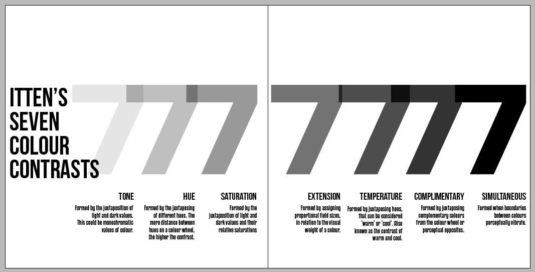

On this page I really tried to experiment with the number 7. I found this quite difficult, but I decided on going through the gradients to the last 7 on the page being fully black, signifying the end. I aligned each category and its explantation to the straight part of the 7, and justifed them right as it was a similar direction to the 7's.
Page 7 The Colour Wheel - Colour


The colour wheel is probably one of the simplest things a designer should know about. And so I created my own colour wheel on illustrator and I removed all the black strokes so it was purely the colour. I wanted the wheel to be clearly visible so it could even be used. The copy explains the colour wheel but it also explains pantone.
Page 8- Visual Literacy


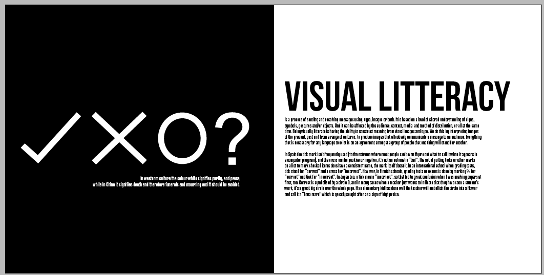


Like the semiotics spread, I had been looking at symbols. I also researched further into symbols and I found an interesting series of answers on a forum that explained how a tick, cross, and circle for marking a students work all meant different things in other countries. I found it interesting and it was more applied and so easier to understand the meaning of visual literacy. And so I used these symbols to illustrate my spread and I also added a question mark to symbolise confusion. I later realised I had spelt the word wrong and changed it.
Page 9


In my initial drawings I had experimented with the idea the words would merge in to each other to play on the idea of reading and the ability to see a glyph. This is explained in the copy of the spread. I fit the word readability behind and in between the word legibility.
Page 10


On this spread I literally used the page to explain some layout terminology. I used the grey squares to highlight what a column and a row is. Also the black line to show a margin. It's playful with the actual terms in correspondence to the spread itself.
Title and Contents


I wanted the title and contents pages to be really simple, and to the point. And so I made them purely type.
The title on the title page is placed centre of the two lines based on the golden section. Justified right and on the right hand side of the page almost leads you to turn over the page.
On the contents page I just wanted to keep it simple and so I split the pages up into the sections of the book, numbering them one to ten as the book is 'ten things'. There is also an equal space at the head and foot of the page. Its simple and clear, not the main focus of the book.

Final Book
I printed my book on an inkjet printer, it was double sided a2. Onto a thin matte stock.

I then cut out each page individually, with a scalpel and a metal ruler. They where almost perfectly aligned, but this is due to the printer.

I then folded each page individually and put them together, I found this really confusing.


Front cover with all the pages inside.

I then staple bound my book, if I'd of given myself more time I would of like to of stitch bound.

Example of how the pages open as a book....


