Firstly I drew out some thumbnails, looking at my research I had collected, I found a particular design really influential, this is .....
I then began to develop this digitally, firstly I came up with a small poster , that would fit on A4 (as this would keep the cost low)
I had to use the two colours we had chosen, but I think that these designs could look different on different stock, and I am going to test the final ones out.
At first I stuck to a very minimal layout, the minimalism is a metaphor for room for creativity and room to get involved. However I think that after I tried it in each colour its not completly obvious to the Designers Dose brand, and this is something I needed to address .


I also added an empty white box, as if it is encouraging you to design in it or fill it with design, it is also quite a strange thing to see on a poster and it may capture peoples attention.


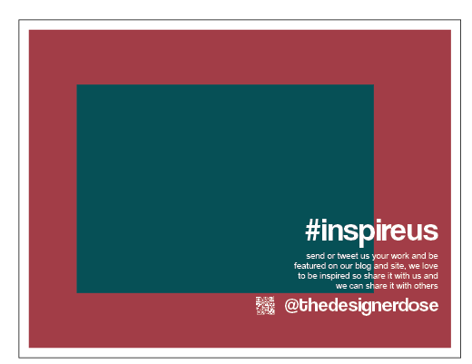
I then tried to incorporate both colours, and i experimented with the layout of the hash tag. However I still felt that there was no enough of a balance between the colours


And so I changed the box to the teal colour and this created more of a balance and it would be more recognisable to the brand.


I also decided that the logo should go onto the posters as then it really reinforces the domain.


I think that this variation below is my final development of this poster, there is a good balance of colours, negative space and the box is empty, ready to fill, you can also see the call to action and the logo clearly which shows this poster is for the designer dose, (on twitter which has links to the blog and website)


I think I liked this development the best and so I would propose this to the group as a final, ready to be printed, I like how it slightly invades the box yet doesn't take over, there is a sense of sharing and still there is a sense of a space waiting to be filled. I also like how the logo is a lot smaller than it was on the previous development, yet its still visible. Again there is a good balance of colour.

After showing the posters to the group it was decided that the portrait version was the best and more in keeping with other promotional materials, as you can see the group felt that the name needed to be on the poster and it needed to be clear that the designers dose was the name not #inspireus . And so I placed the name next to the logo and the group decided it should be positioned at the top of the page.

When it came to printing we decided that the costs had to be kept as low as possible and so we put two of the designs onto one sheet of A3, they where inkjet printed onto plain white stock.
We tested the original poster, and the qr code was too small and didn't work unless it was black with a white background, also the colours had printed out wrong as the hex code we had set it as an rgb colour mode. However I transferred my design into photoshop and this worked as the colours had been set up on photoshop. Also the website address was wrong.

And so I printed the two from photoshop, and they came out at the right colour. But I realised there was a black stroke around the qr code and this didn't fit into the colour scheme, and it didn't look right.

I also decided to change the size of the posters, into more of a flier size, this also meant I could fit 3 posters onto one page and this meant it was more cost effective. I tested them in grey first to see how they looked physically. I felt that they looked right and so I went on to print them in full colour.

Printed in full colour...

Final Poster...
- With correct email address
- And working qr with no stroke

I then put some of them up around college on the notice boards and left some on the tables in the cafe ...


Hopefully these will grab peoples attention and encourage them to start sending in work and tweeting.
No comments:
Post a Comment