

Initially after my first development sheets, I had decided on the idea of a key , and 'unlocking' success. And so I began by designing my keyhole design. I did this on illustrator using different shapes.


Then after doing some initial sketches, I just put a circle around the keyhole so that I could experiment with a colour scheme. I knew I wanted the colours to be quite light and bright, and maybe a more pastel shade.


And so the colours below where my final colours, I chose blue and pink, to represent boy and girl I also felt they where light and warm, which makes them friendly and inviting, just what a nervous first year student would need to feel welcome.

(A round up of all the potential colour schemes I looked at)


I drew out the full size of the pack, which fit onto A2,

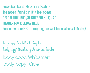
Below I looked at the fonts in context to the keyhole,


Content

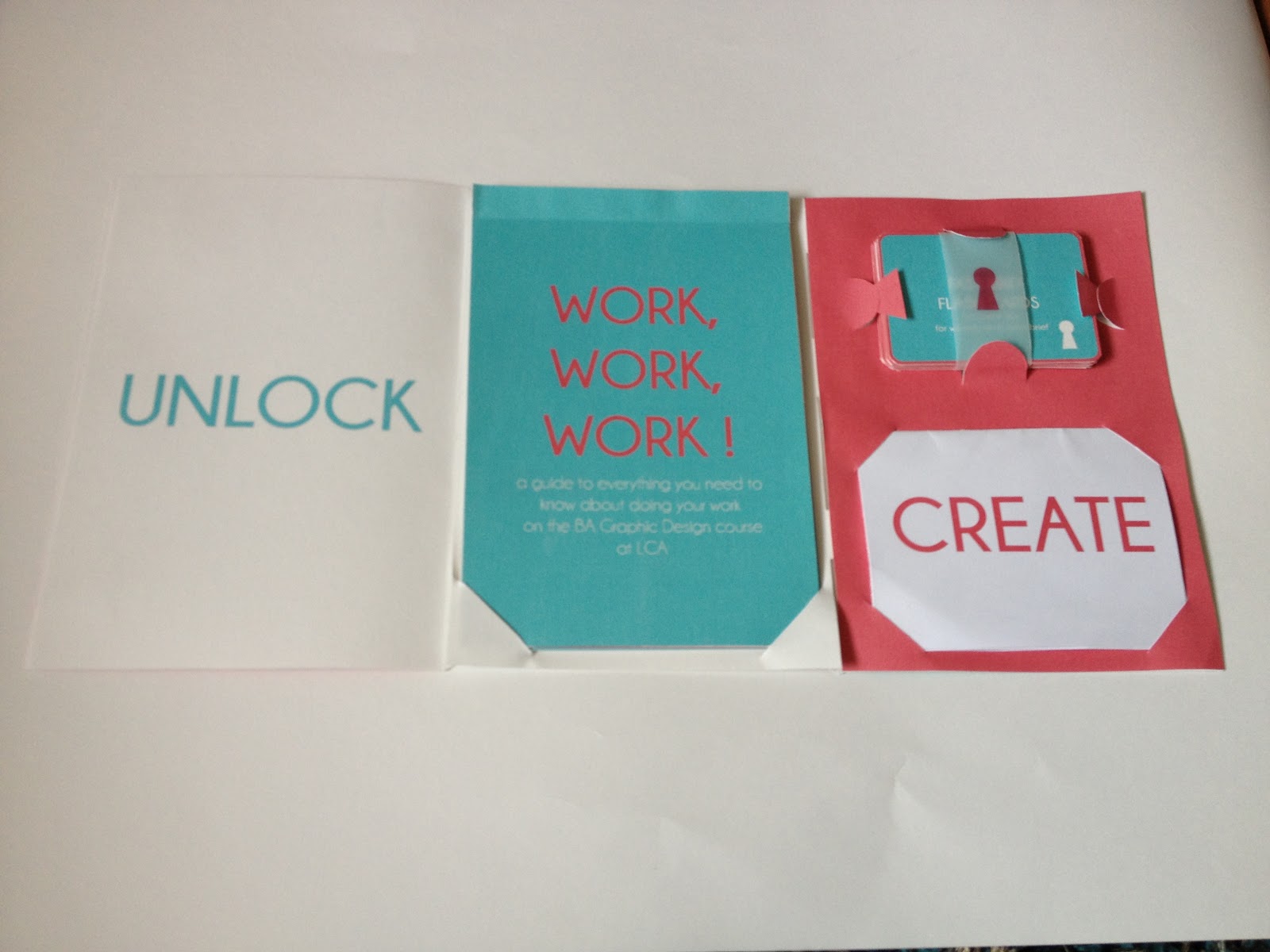
ID Card Insert - Which will be inside the fold out poster about blogging.
I began by measuring the actual size of our own ID lanyards...


I then began by designing the content. I felt that it needed to be colourful , and so I picked the pink as the main background colour.


I changed the copy to a central justification and the card became more even and less chaotic.


This is the back of the card, I just rearranged the colours and made it really minimal as the back of the card is the main focus. Originally I would of liked the keyhole to be cut out, however I did not have a laser cutter induction, although I have laser cut before, I thought that the laser may burn the cartridge stock I was planning to use, or even set fire to the whole thing.


Blogging information, fold out poster (just less than A4)


However I wasn't happy with the poster design I felt it was too full and so I started again. As well as this I hadn't incorporated the back of the page and the folding of the poster.
And so I began by thinking about the folds- which I referred back to a mock up I had made.


Fast Brief Flash Cards


Back of the card printed, I left the white edges on in preparation for the other side of the cards, I printed this onto cartridge paper, I really liked the texture the stock provided, its also off white, and almost has a warm tint too it, again making it look more friendly, and harmonious.

On the card below I tried cutting out the key hole, but I think that it may be a bit too unfinished, and It looks unprofessional, however I do like the effect, and you can really see it on the silhouette too.

Designs for belly band to keep the cards together

I then decided to make the 'types of work' section into more of a flip book product as I felt it needed to be held together, I also decided to make all the content related to any way in which you can work, and things that aid you in your work, rather than relaying what types of work there is.

I began by designing the front page, I came up with the slogan work, work, work as I thought it was more interesting, memorable and effective than the sentence 'types of work'. It also would startle a first year and they might get a little bit worried and therefore want to know what the sentence means, and so they would read further.
Originally I started with the keyhole, and the type underneath, similar to the logo I had created.

I then began to play around with the size and position of the type.

After some experimentation, I had designed this, I liked the way the words aligned centrally and the way you read each word as a separate line, the commas automatically mean you pause and so the words really go into your mind, and stick there. As it is broken into three lines its less daunting than one big line of text. Also I liked the point size of the font, it is just large enough so it captures your attention, but small enough, with enough negative space to draw you in. However I still wasn't happy with the keyhole, it was distracting.

And so I removed the keyhole, and added in some sub-copy, which explains what the book is about. I found this much more effective, and the page was now ordered in hierarchy, with the title first and sub heading second ( and smaller).

I did try it with the key again but it was too distracting and the type becomes lost, and so I stuck with idea above to look into further.

I tried changing the colours around, in this idea the white space is far too much, the type in the middle looks smaller and lost, the negative space is off putting and glaring.

And in this one the white again is too contrasting.


I eventually decided upon this (below) the copy just spans a little wider than the title and so it looks even. As well as this there is only one extra line, in comparison to the title. Which means its not longer than the title.

I then began the second page which was going to be about types of work materials, I began by drawing my illustrations on illustrator, I chose to use the pink colour as it was opposite to the front cover, as well as this its really bold and crisp.


This was the final page, I think that the illustrations are really detailed and so the white space works. I also decided to give each page a simple title that would motivate/ inform the audience. I also decided to brand each page with the small keyhole and name 'unlock success' to really get the idea across.

The second page was about where to work, instead of just naming the studios, I decided to draw a simple floor plan on illustrator, I think that visualising the floor plan would be helpful to a first year student as they would be able to tell visually which room is which.

Originally I made this page, blue and pink with a white background, however I felt that the white again was too over powering.

And so I tried changing the colour of the type to see if this would help,

But on this idea there seemed to be too much of the pink and it seemed un balanced.

And so I tried reversing the colour scheme, this seemed to be more effective and the white strokes looked really vibrant, and interesting.

Then I picked pink and white and this really worked.

Then when put it onto the page I added the blue to the keyhole and the title which really separates the page and helps the reader to pause.

I decided to link on the next page with the previous one, by naming other rooms in college that we use or have used in first year, again I decided to draw a floor plan of each room, however I didn't include the vertical lines as all the rooms on this page where relevant. I also labelled each room in the spaces around the drawings so that you could see the floor plans. I also made all the content one colour as it was all relevant and it also changes the colour scheme slightly and it doesn't become monotonous.

The design process page, I originally started by just having the title and the steps.


I also decided to mention the first brief, as one it is the first brief and secondly it is a group brief and for many students including myself this was a brand new way of working. I highlighted the main tips.


The meeting deadlines page I made into a analogue clock illustration. I also made the hands five to 12 to indicate getting close to the deadline. It is also more parallel on the page.

I then made a page dedicated to the different types of production available. I did not know there was all of this available when I first arrived and so it is good to inform the first years about whats available and its also quite impressive. I went for the main ones, mainly relevant to the graphic design course. I went for the same style illustrations as the second page, but when I began to draw my screen print icon, I realised I needed to use another colour and so I did this for each icon, which meant I was incorporating all three colours and it was slightly different to the second page.

I also put the content into a list format. And I decide to inform the audience of the locations of the facilities) and the things they can be used with or for. I also decided to use pink for the font as the illustrations where more blue.


Final page. I thought it would be good to end the book how it started, and so I kept it really simple and to the point. I also added the words 'unlock success' to the bottom of the title and so it is almost saying good luck you should be now able to be successful. More so than before reading the book.


This is the flip book all printed, I printed them out as separate pages, and cut them out with a scalpel and metal ruler.


Then to make the pages into a book I measured the 15mm margin which I had left on indesign, I drew a pencil line on the back, I then scored with the scalpel and folded.
To bind it together I glued along the back of the fold and stuck to the next page. This created an almost notepad like effect, which is what I wanted, I think it worked successfully, and the whole book works well.

I began to create my pack I did this my printing each sheet separately, ideally I would of liked to have printed it out on one A2 sheet back to back, but I had not planned well enough ahead and booked a printing slot in digital print, but as well as this I did not want the colours to alter due to being printed on different printers.

'Create a Blog' A4 Foldout Poster-
The first thing you see is create, which to a creative person is a word that would draw you in or capture your attention. I also made the type pink as I knew my flash cards where going to be blue. Also the pink is a stronger colour and tonally darker, so it stand out more.

Then when you open it it reveal an 'A' which makes the sentence so far 'create a' ... and so it makes you wonder what it is you are being told to create. Again a minimal design with lots of negative space, but nothing else is needed on this page, especially as the final page, A4 page is quite heavy with copy. I also kept this the same colour as the first word to give the sentence a continuity and a link.

Then finally the last word of the sentence is the darkest/ largest piece of type on the page, is 'blog' and so the whole sentence connects. As well as this I have split the two sides into blue and white. There is also the small ID card insert in the bottom right hand square, which when moved reveals a pink keyhole, which ties the hole branding of the pack together.
I printed this poster onto a thin matte stock, as it was double sided and needed to fold easily, it wouldn't have worked on the cartridge stock, as it is too thick/ heavy. And the ink would of come of in the fold of the cartridge paper.

And then when I was creating the pack I had to see if the poster fit into the page and it did, so here it is in context, I decided to use all four slits as it would be even/ symmetrical and would not take your attention away from the word 'create'.

I then had to try putting the flip book into context too and it fit and the flap came over well, just revealing the words 'work,work,work'.


I also developed by belly band further by printing it onto layout paper, which is more durable and more transparent, I experimented with different sized keys and both colours...

Small pink keyhole belly band...

Large pink keyhole belly band ...

Large blue keyhole belly band ...

Small blue keyhole belly band ...

I really liked how they worked and they kept all the cards together, I chose to use the big pink key, as the pink worked better because the background of the cards are blue. And the key had to be bigger than the one on the pack of cards too.

This is the final products all together in one pack, I liked how they looked together.

After crating the original pack, packaging I found that when you opened it there where too plain blue sheets in front of you, which isn't very interesting, and it almost puts you off opening it further, I also found that when I closed the pack the flash card slipped out of place. And I had also left the original name 'the key' on the front of the pack, whereas non of my other material contained this name, I had changed it to 'unlock success'. And so I changed the front to a minimal look, just the keyhole.

Inside of the new pack, the middle does look slightly empty however with the flip book in place it is almost all blue and so you don't see the vast white area.

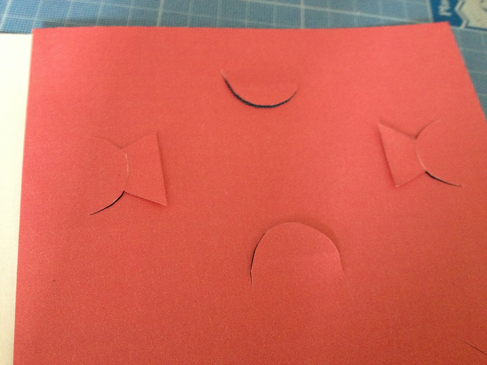
I altered the tabs for the flash cards, I did this by adding two side tabs, however they where a bit too far apart and I added the triangles, so that the tabs would look like key holes.

Final pack !

Front of the pack, is a simple, minimal design, they white key draws you in, the packaging is all on cartridge paper, as is everything else except the A4 fold out poster.

And finally the whole pack together, I think all the type works together well, and I am glad I got rid of the flap where the flip book is, its now all visible and there was no need for the flap. As well as this the flash cards now do not move about and the side tabs are meant to look like the keyhole logo.
No comments:
Post a Comment