Body Shapes Advise Leaflet
The purpose of this leaflet is to help customers to decipher what 'body shape' or 'fruit' they are most alike. This would mean that in-store they would be able to shop their shape and they could also do this online with visual cues, such as the single fruit symbol.
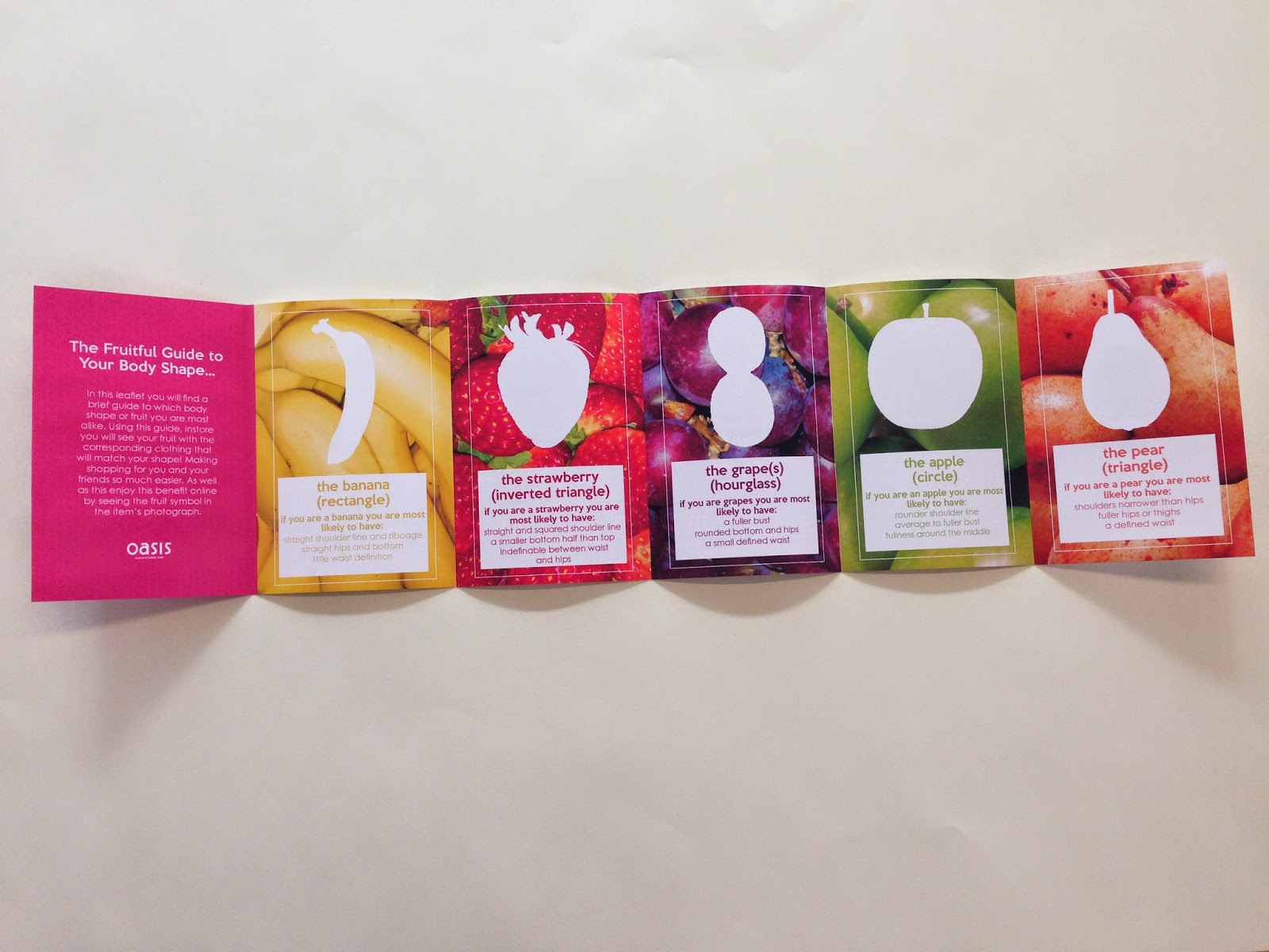
The leaflet has each of the fruits and a quick summary of come of the characteristics of that body type.


Final Printed Leaflet.
On the reverse I designed it very simply, when seeing the print you can see the copy better. The copy on the back matches each shape which is on the front, they are also the same colour as the fruit copy that had been selected.
The copy states the shape but has a positive message along side it for instance: 'green with envy for ; apples' the copy also matches the type of the fruit labels designed by Melissa, meaning the first line is the copy font (from the posters) and the second line is the header font.

The inside of the leaflet is very vibrant and eye-catching, I used the fruit photographs as the background for each, I also used the white outline of the single fruits that I had done on photoshop this is to emphasis the look of the body shape. I then added a white box at the bottom of the symbol and wrote out a few aspects of that shape as well as the fruit name and shape name, this is one of the only times these have been put together and so for the customer to fully understand this would be quite an essential part of the whole concept. As well as this I wrote an introduction which explains the process of fruit to body shapes, and it also explains how they can use this in store.
(Which is through labels with the specific fruit/shape on them on the related or appropriate clothing so that the customer could shop their shape)
How the leaflet works...
It is a pocket sized guide that opens out into the five shapes, it does this by continuously folding outwards, it is not a concertina and it would not work in this way.


Overall I think that the leaflet is successful and I think it is an appropriate and necessary part of the overall idea of the messages. I feel that the inside of the leaflet is much stronger than the reverse, it is vibrant like the posters, and I think it explains the concept well. However I do like the reverse its simple and too the point. Throughout the leaflet and the messages there is another underlying message of positivity, it doesn't say one shape is better than the other it simply helps women of all shapes and sizes, and the leaflet does not state that that shape is necessarily what the person is it just gives them advise and so it is not directive or to the point meaning its more like a friendly advise services, which is what customers want really.
And so I looked online at the oasis website, I saw that they have a rectangular image and a square one like a 2/3 and 1/3 format. I thought that the messages would easily sit in these spaces and they could range in position and which message was being displayed. I thought that the nine messages could be on a rotational basis and each time the home page was selected a different message would show. This would just remind the audience of what the store has to offer and it may encourage them to come to store as they have more services and more personal services than online has to offer. But its not to discourage online shopping either.

With this in mind I developed a simple way that the messages could also encourage online shopping. This would be in the form of a small fruit symbol next to the item of clothing it was appropriate for. I also thought a more advanced way that this could be used is that the symbol could be filtered and every item of clothing appropriate for that shape would appear, whether it be tops, trousers, skirts, dresses etc.
So for instance the fruit symbols would be in-between the information of the name of the item, and the price, the fruits would vary when unfiltered and all different fruit symbols would be visible. This is so anyone could see the variety the store has to offer.

Closer up...

When the item is select a larger information box appears, I placed the fruit symbol in the top right hand corner aligned with the name of the item and price, this is clearly visible yet un-distracting to the actual information, it acts as a reminder. The fruit symbol is also larger than before as the information itself is larger too, I also wanted the symbol to be really visible.

(All Mocks together)
These mockups where on the original boards but after a final crit before we had to submit the response to YCN, it was said my a few people that the boards where too crowded, I looked back on the boards I had designed and I felt that these comments where fair and so I separated the online/ digital mockups into three.
(I decided to show the digital responses across a range of devices as I felt that the audience would either own a computer or a laptop, or both, and a large percentage of them would own a smart phone.)

1. How the fruit symbol works online...

2. The messages displayed online...

3. Social Media...
I also thought about how the concept would work on social media sites- after all one of the messages states that oasis loves social media.
And so I mocked up an instagram post, where @oasisfashion would post new items or items that where appropriate for the fruit shape they where writing about for instance what I had written as an example was ‘absolutely pear-fect’ for pear shapes. But instead of just these kind of posts Oasis could show celebrities and their shapes and use the hash tags to show this. For Facebook the time-line would simply change fruits and messages every week, And twitter could act in the same way, but Oasis could also tweet about new arrivals etc.

Facebook


No comments:
Post a Comment