When developing another brief I saw a font that I felt would be appropriate for the loft 310 logo. The font Petit Formal Script, is elegant and sophisticated, I liked the way it joins and that is italic.
When I typed it out on one line I felt that the 310 didn't connect to the word loft, they looked to separate. And so I moved the number underneath the type.


I then noticed that the top of the number 1 and the descender of the f would fit together in a diagonal line, and so I connected the two together.

However I felt that it looked too prominent, and so I moved them away but still in line with each other, which still connects the type.

However I did want to show this line and I drew one through it with a smaller stoke, I felt that this was interesting however there was still no element of an abstract shape, which the brief required.

And so from some brief research into 'lofts' I noticed that a loft is also sloped as it isn't an actual room.

I looked at adding a window to the logo but this makes it too complicated.


I then looked at pointing out that the right hand side of the shape is the 'loft' and that the other side would be up in the sky, you would see this from a loft. However this looks too childish.


I preceded to remove the extra line and connect to the previously drawn curve.


I wasn't sure as to whether the shape was too wide, and perhaps didn't balance out the left hand side.
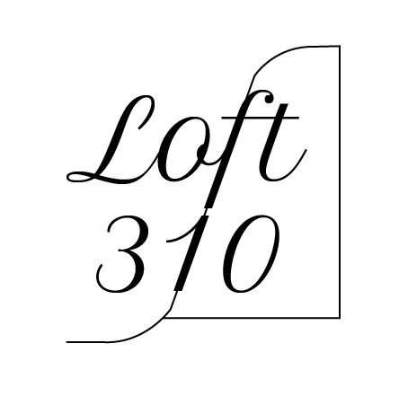
But I felt when it was made shorter the idea of a loft room disappears. I had left the logo black and re-wad through the brief realising the brief specified that they wanted the logo to be either or all , grey, silver, white, purple. And therefore I changed the logo's colour to a light grey, which adds femininity . When I submitted I specified that the logo could be used in any colour.

No comments:
Post a Comment