The Home Page-
The home page consist of a navigation bar, and a footer, these are in a light purple, which is to reflect Katy Perrys new more mature but still girly style. All the copy is in white, I feel that this again is in keeping with the softer style of the artist. White also stands out well against all the colour and imagery, it is also different to a lot of websites that use black.
The navigation bar consist of the four pages, which are the four albums and the logo. The four headings are all rollover buttons and change into a triangle (prism) as you hover over it, they all interconnect. As well as this the logo is a rollover and changes the type changes to home when you hover over it and this is another way to get back to the home page. The font that was used is a thin sans-serif, it is quite angular in appearance and I felt that it worked with the font for the main copy, which is a bold, even more angular sans- serif font which adds to the feel of triangles and therefore prisms. ( Prism being the new album, the new style, the almost re-brand)
The footer contains all the social media icons and most of them link out to where they should, the address in the bottom left hand corner also links you back to this page on every other page, it also shows the audience what the site is called for future reference. The triangles on the bottom right hand corner are to indicate which album you are looking at and so on this page they are all small which indicates you are not on an album yet.
The rollover button (top left)
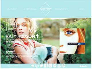
The first page is Katy Perry's first album, this slightly varies from the other three as it only has one image on the page this is because the imagery for this album was very hard to source as the album was not really successful, but I decided to show this album as it was her first and fans of her music now may not be aware of this album. Also some of the content is different for example the platinum rating, as it never received one I couldn't but it on, I added the fact that this album was gospel whereas all of her other albums are pop.
When your on any of the pages the buttons are all rollover and when you hover over the button a triangle appears, this is to keep in with the triangle/ prism theme.
As you can see the style of the page changes to the album it is about. This album was a lot more racy than the first and this reflects in the bright red/pink colour, the navigation and footer really stands out on this page. Again all the copy in the two bars remain white as they do on every page, I think that this gives the site some continuation as all the album pages are different in appearance.
The third page/ third album is a lot more girly and the imagery I chose to use where more focused on images from the tour, this is because this tour was hugely successful and it is famous for the sets and costumes, which have made the album really iconic. However from my initial design on InDesign I haven't added a blue stroke, as I felt that the content stood out enough and I did not know how to add a stroke in the code.
The final page, the new album page again slightly varies from the previous two as it is new, so certain information has been made more present for example tour information has been changed to tour sales and directing the audience to go buy tickets, which is what they would want to be doing. I felt that the imagery on this page is not as strong as again there was not as much available as the album has currently just been released and content from this album is just starting to build up, as well as this I had used some of the imagery for the home page as well and I did not want to repeat images. I also made this page more futuristic, really supporting the new future of Katy Perry. Whereas on the other hand the home page is the other main theme from the album which is light, and floral.
Each of the icons link to the appropriate page…
 |
| Store Icon - links to the store |
 |
| Itunes Icon- links to the related album |
 |
| Twitter Icon- links to Katy Perry's official twitter feed |
 |
| Facebook Icon- links to Katy Perry's facebook page |
 |
| Instagram Icon- links to Katy Perry's official instagram |
 |
| Pintrest Icon- links to Katy Perry's own pinterest boards |
 |
| Youtube Icon- links to the related album |


No comments:
Post a Comment