I began by drawing the site map to decide what would go onto the site…
I decided that there would be four main sections, and that the site should be relatively simple as its main function is to sell.

The homepage, I decided to have a very simple look to the site, the home page is minimal, yet I think effective, it is obvious what the site is about, the picture also looks modern and stylish, it is intriguing. The bar at the top has the four sections, I felt that my audience would want to be able to get to things quickly as they may not have a lot of time to look through lots of content.

The menus would drop down like so… they reveal the categories underneath each subheading, I chose to use an opaque box as white was really in your face, the opacity also gives almost a glass like feel, and it is different. As well as this is doesn't detract attention from the image. The colour of the type is opposite to that of the bar, this helps to balance the page, with opposing colours for different menus.

One of the first pages would be 'who is orbotany' on this page there is an explanation of the name, the store and their values/ aims. The layout again is very simple, I wanted to use photography as I find it more striking on screen, but as well as this the type is quite linear and round, the square image contrasts this. It also would give the audience more of a feel for the store and the brand.
On the page there is a subheading and all the information is bordered in a light grey box. I decided to do this as it holds all the information together on the

Another major section would be the 'plants' page, on this page the user would be able to browse through the range of plants in store and they would be able to select a plant , and this would take them to a further page that would provide more information…
On this page the plants are divided into a grid of three, the scroll bar would be fixed and the plants would seem to disappear as they move up and down the border of the grid, (as I have tried to demonstrate)
The plants have their name, and the price as I feel that this is the key information, and this is how you would see content like this on a different website that also tries to sell.

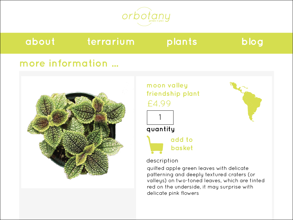
Below is the more information page, this information is the same as the information in the 'guide to greenery' booklets. As well as this is an add to basket option, where you would click the basket and be taken to the basket. And there would be a quantity box where you could select the amount of plants you wanted.

Terrarium Section
- the grid is the same as the previous page, an image and a column of copy, also it still has a grey border, it is almost fact file like, it is very easy to navigate and would be very quick to navigate around.
On the 'further tips & advice' page the audience would be able to leave comments and there would almost be like a forum set up. So that they could help each other and it becomes more interactive.

The blog, is a looser grid structure, there are three sizes of images and they would vary throughout the blog, this is more interesting, and shows bait more personality and would entice the audience. Some of the images have the title, subtitle and posted date information visible, and some of the images have non this means the audience would have to click on the image to find out more and this could also be a way of getting the audience to join in.
On each blog post at the bottom the reader would be able to leave their own comments.

How the site would work/ look on a smart phone…
I decided that the site would be more appropriate just to change on the smart phone rather than be an app, this os because 'orbotany' is very specific and I do not think from the 1000's of apps it would be easy to find and as well as this, an app is quite interactive and I do not think that the audience would particularly want to be so interactive, and this is why I have made the site smartphone friendly.
And so as you can see the first screen would be the four options, the rectangle look has changed from horizontal to portrait as this is the direction of the screen. The page is simplistic and modern, there is a balance of colour, image and copy, it is very easy to navigate and make quick choices.

When you select the main category a sub menu would appear in its place. again it is the same layout as the previous and almost identical to that of the original website.

The plants shop would now change to one central column grid too, I feel that this looks better on a smartphone screen as the image and text is big enough to see. It would scroll the same as it does on the site.

The more information basket would be one grid in a vertical style, with the information below, this would scroll better and all the information is central.

The blog is one image less, and so it would scroll for longer, but it still follows the same tile style.

The contact page on the site would contain all the information and the email address would be linked to email so you could get straight on to it. This would be the same on the actual site too.
The about section would also contain a location page and on the page would be a map on google maps and this would also give you directions from your current location. Just as google maps does. This would help the audience and again save them time.

After the crit I decided to take upon the advice I had been given, and so I changed the colour of the body copy to black, because of the on screen nature the green as copy was bait unreadable and could possibly hurt your eyes to look at for too long, also the black adds another dimension to the aesthetic and I feel that the site now looks better for this change.


I kept the basket the same colour as this makes it stand out and this again is easier for the audience if they already know what they want.


Upon reflection I realised that the basket isn't accessible. And that the on the 'plants' page where you can browse , it is almost random and the audience may want to search by a certain category, and so a search engine needs to be implicated.
And so I have added the shopping basket icon in the top right of every page, you would click on this to see what you had in the basket. The logo would act as a return to home button.
I have also added a search by toolbar, you would click the down arrow to reveal the options which would be; price, A-Z, origin, size, (conditions) light, temperature and moisture.

I have also added the basket in the same position on all the iPhone pages, it would act exactly the same as the actual site.
Again I have added the search tool to the plants section, and it too would reveal the same options as previous.

No comments:
Post a Comment