Friday, 14 February 2014

Loft 310- Logo Development

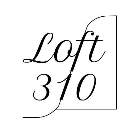
When developing another brief I saw a font that I felt would be appropriate for the loft 310 logo. The font Petit Formal Script, is elegant and sophisticated, I liked the way it joins and that is italic.

When I typed it out on one line I felt that the 310 didn't connect to the word loft, they looked to separate. And so I moved the number underneath the type. 


I then noticed that the top of the number 1 and the descender of the f would fit together in a diagonal line, and so I connected the two together.


However I felt that it looked too prominent, and so I moved them away but still in line with each other, which still connects the type.


However I did want to show this line and I drew one through it with a smaller stoke, I felt that this was interesting however there was still no element of an abstract shape, which the brief required.


And so from some brief research into 'lofts' I noticed that a loft is also sloped as it isn't an actual room. 


I looked at adding a window to the logo but this makes it too complicated.


I then looked at pointing out that the right hand side of the shape is the 'loft' and that the other side would be up in the sky, you would see this from a loft. However this looks too childish. 

 So I took the cloud out, I liked the idea of room, but I felt that the line at the top was just adding extra detail. 

I preceded to remove the extra line and connect to the previously drawn curve.


I wasn't sure as to whether the shape was too wide, and perhaps didn't balance out the left hand side.


But I felt when it was made shorter the idea of a loft room disappears. I had left the logo black and re-wad through the brief realising the brief specified that they wanted the logo to be either or all , grey, silver, white, purple. And therefore I changed the logo's colour to a light grey, which adds femininity . When I submitted I specified that the logo could be used in any colour. 


Thursday, 13 February 2014

Oasis: Re-Wording the Messages

Me and Melissa sat down together and discussed the messages. We wanted to keep the system of a message and answer but we discovered that they could not always be questions. Using the sayings research I had looked at we kept this in front of us as we discussed appropriate tag lines for each message. In doing this we also discovered there where only 9 messages not 10, however we still felt it appropriate to use the five shapes/fruits as this gives the customer more choice. 

And so we wrote down the 9 ideals Oasis wants to portray and then we wrote the new message at the side of it. 

We both came up with different ideas for different messages and we helped each other to get all 9. Some of them we had to swap around and change, but we where happy with what we had achieved. 


And so we had an almost equal distribution of the fruits as I had tallied at the bottom of the sheet. 

The Messages: 
  1. 'Berry Busy ?' (Very Busy) We offer delivery slots at a time that suits you. - Strawberry
  2. 'Go Bananas !' We now accept paypal in store, just download the app - Banana
  3. 'Get the Pear-fect Look !' Personal stylist available instore - Pear
  4. 'I heard it through the Grapevine' 15% off for students all year round (with a valid NUS) - Grape
  5. 'Has it all gone Pear-shaped ?' can't find your size ? we will track it down and deliver it to you for free - Pear
  6. ' Get Grape wifi signal !' free wifi instore
  7. 'Sweet Treats' with My Oasis card, apply for a loyalty card instore today to make shopping even sweeter - Strawberry 
  8. 'We are bananas for …  ' Twitter/ Facebook/ Instagram - Banana 
  9. 'Who's the apple of your eye ?' Give them a gift card, purchase instore
I feel that these messages work well with our concept, they are strong and and our still quite true to the original messages. The word play is also fun and exciting. I think that they would work well instore.

Collaborative Agreement

The Final Agreement
(which we did sign afterwards ! )
I feel happy with agreement, we had only made a few changes as we had already been quite specific, but it helped to know the concept we wanted to follow. 


Concept Meeting

After doing the initial research and coming up with a concept, me and Melissa had a discussion about what we had looked at individually. We talked about what ideas we had and we decided that the idea of body shapes and corresponding items- fruit was the idea we wanted to go with. 

We decided to make all the shapes fruit based. As many of them already are. We also felt fruit is colourful and vibrant it also promotes a healthy image. It is also appropriate to all ages and is relatable to women especially in connection with the shapes. 

We wrote down some thoughts and decided upon five body shapes … 

Apple 
Pear
Strawberry 
Grapes (Hourglass)
Banana (Rectangle) 

Five also splits into two fruits for each message, as there is ten messages. 

First draft plan of agreement 


The first agreement was quite vague as we didn't have a concept in mind and we didn't know what we wanted to create or how. And so we needed to come up with a concept in order to get a better agreement. 


Project Rationale/ Action Plan

In the session, we got into groups in our pairs we had to present our initial ideas and our concept. I felt like we had a good concepts and we both knew what we where talking about and so I felt that we understood each other and the idea itself. 

People thought that we had a strong concept and liked the idea of taking the messages further especially with Melissa's idea of clothes labels. 

From doing this we also saw what other people had done and this was really insightful and got me thinking about our own brief. 

We also had to discuss our own roles and responsibilities we had set. And this was similar to the other pairs. 

After the crit we had to write a project rationale and action plan. 

We started by answering the project rationale, we got to the part where we had to state what we would be producing and we weren't sure as of yet so we moved onto the action plan. 

However before even writing the action plan we made a list of what exactly we wanted to produce and how it would be done, what would be mocked-up.

  • Labels for the clothes x5 (printed)
  • A3 message posters x10 (mocked up/ digitised) 1/2 printed and mocked up
  • Online guide to shapes ( 1 page mocked up) (5 sub pop ups)
  • Leaflet guide to shapes (printed)
  • Gift Wrap (x5 mocked/digital) (x2 printed)
  • Paper Bags (x5 mocked/digital) (x2 printed)
  • Stickers (big for displays/ small for bags) 
  • Instagram/ Twitter/ Facebook (mockups)
  • Window display mockup (mockup)
We then wrote this up onto the action plan, knowing that we would have to design everything firstly and then secondly we would have to mock-up or print and make some of the printed ephemera. 

We aim to have a lot of initial design choices and imagery made by next week (20/02/14) and we hope to have everything digitised for a progress crit the following week (27/02/14).

We then finished the project rationale by writing what we intended to do and how we where going to do it. 

Action Plan 

In doing the action plan I felt that we gained a better understanding of the roles each of us would undertake and what responsibilities we would have. 


Project Rationale 


Thursday, 6 February 2014

Session 1- Deciding upon a Brief & Collaboration Contract

Creative partner: Melissa Hardcastle

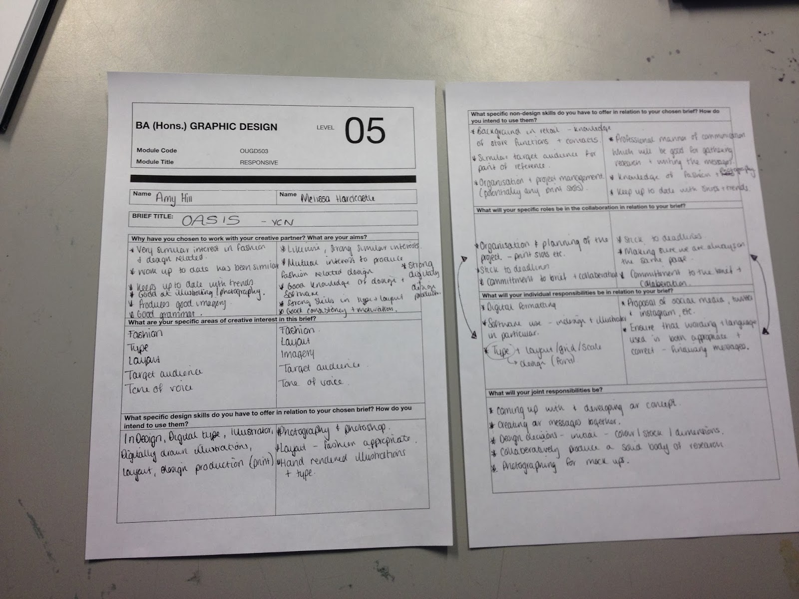
For the session we had to bring along our own sheet explaining why we had chosen our partner and what our expectations of the briefs our… 
the three briefs we had chosen where

D&AD 

  • National Trust
  • Unilever


YCN 

  • Oasis
Why have you chosen to work with your creative partner ? What are your aims ?
I have chosen to work with my partner, Melissa, as I feel that we have similar interests within and beyond graphic design. We both lean towards design for the fashion sector. I aim to use this very similar interest and understanding to our advantage. I also aim to learn how to work with another person as a collaboration and splitting the roles. I also aim to learn a little bit more about photoshop as I think Melissa might be able to teach me some things I don't know. 

What are your specific areas of creative interest in these briefs ?
The Oasis brief as mentioned appeals to my sector interest, as well as this the target audience as well, and the type orientated nature of this brief would suit me better. The National Trust brief also interests me for its values and its environmental side. The response to this brief could also be quite organic, and this interests me. Finally the Unilever brief interest me due to its social aspect, and aiming for social good.

What specific design skills do you have to offer in relation to your briefs ? How do you intend to use them ?
I have a good sense of layouts and using grids, which produce well organised responses. I also like type and a lot of my work is more type based, and I think especially for the oasis brief this would help extensively. As well as this I am quite good digitally and this will help us as Melissa isn't as experienced. 

What non- specific design skills do you have to offer in relation to your briefs ? How do you intend to use them ?
I am organised and always manage to do a good amount of work to a good quality in the time that I have. I think that this will help us as I can project manage, and plan the time wisely. I also know about the production of design i.e. print and I know roughly how long / how much things take and cost. I would also say I am quite understanding and will listen to comments opinions and I can compromise and I think that this will help us to move on quickly in the project. 

What will your specific roles be in the collaboration in relation to the briefs ?
I think that we will designate roles between us, and not do everything together. I think that at this point I will mainly be in charge of type and layout , and a lot of the digital- unless it is photographic. I think that Melissa will mainly be in charge of images and imagery.

What do you think your responsibilities will be in response to your brief ? 
To keep to schedule 
To remember things
To listen 
To manage time responsibly 
To collaborate and to listen

What do you think your joint responsibilities will be ?
To arrange and keep to print slots
To meet deadlines
To inform each other of where we are at and any changes


The Session 

And so in the session we had to get out our three briefs. We then had some time to go through each brief and list the pro's and con's. 


For the session I printed out our briefs and so when we annotated the pro's and con's we talked about them but then wrote them down in our own way. I decided to use post-it notes as I didn't want this on my brief, where I would rather have other annotation. 

Oasis 
Pro's
  • Fashion Based- Design would be for the fashion sector, which interest us both.
  • We are / are similar to the target audience 
  • We both like designing for this audience
  • Could be quite easy to obtain primary research/images
  • Tone of Voice- achievable, easy and relatable, its also positive which makes it fun to work with.
  • Mandatories are very open
Con's
  • No actual age mentioned for the target audience making it too broad there is no specific audience
  • Already have quite a distinct style would they like a slightly different style ?
  • The set response ranges in its requirements, i.e. you can just write the messages or you can design them. This means that someone might not be putting in the same amount of time.
Unilever
Pro's 
  • The brief is about doing good socially and this to me is important and a good cause/ purpose
  • Products are well known and easy to get information and images on. 
Con's 
  • Slightly earlier deadline
  • 'This is a big complicated brief' - This could be too much to take on especially for a first collaboration brief. And it may be too broad
  • Choosing your own target audience again is too broad, it's like they don't really know who to target next
  • The products they want to use don't exactly solve the more serious issues, and they don't really help in certain areas i.e. Ben and Jerry's - Health
  • The deliverables are anything, they don't really know what they want either.
National Trust 
Pro's
  • Easy resource-able primary research
  • Nature based
  • Personal knowledge and experience of some of the sites 
  • The campaign offers scope for design
Con's
  • A lot of people have preconceived ideas of the National Trust and it would be hard to really impact on the mind set of these people.
  • The target audience is perhaps too old, the age range especially late twenties to forties may already be visiting these sites as couples, with dogs, for leisure or with children as a family, and so this specific audience doesn't seem quite right
  • 'Old fashioned ways' they themselves need to address this issue maybe a rebrand, or something would help them over one campaign.

After this discussion we had to decide which brief we wanted to answer , we chose... 
 
Oasis

We then had to discuss the collaboration contract in which we would agree to our roles and responsibilities. 

This is the first contract we wrote, but like most pairs in the session these where slightly vague due to the fact we haven't had chance to get some initial ideas on the brief itself. However I do think that me and Melissa devised this contract up quite easily and I feel that there weren't really and disagreements. But this contract needs some revising before it is final. 

What are roles and responsibilities ? 
Roles
Project Management
Resources- i.e. cameras, stock, laptops etc
Contacts and information

Responsibilities
Style
Research areas
Fulfilling the agreement
Meeting Deadlines
Maintaining Clear Communication

At the end of the agreement me and Melissa also exchanged emails so that we will be able to keep in contact, and send each other work. 


Sunday, 2 February 2014

Dream Research Boards

Research boards exploring the concept of dreams and dreaming, the first final boards I created...